This is cute, but I thought you spelled it peeeeeeeeeeeeek-a-boo :o)
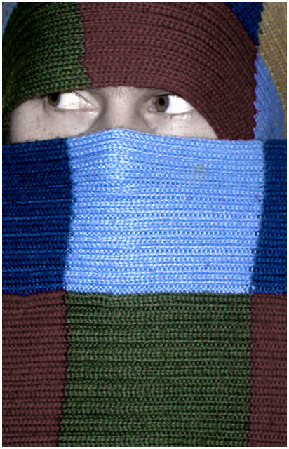
I like the colors and the idea. I think this is one shot where you could center the face horizontally - it doesn't look right so close to the left side of the frame. I have to agree about the skin color. You need some color adjustment to make it warmer and more alive. Lighting is good. Focus is good. I'd prefer having half of the bottom row of squares cropped, but that's just me. I don't really think the little border helps any so I'd remove it. Overall, this fits the challenge, is creative, doesn't need a lot of technical help. I don't think it should be sub 5 by any means, but I guess that's a reflection of the voters' taste more than anything. I bet that if you had used a girl with some mascara on or a little kid then it might've helped some with the score. If you want people to focus on the eyes then they better be really outstanding (no offense) :) Good Luck in the next challenge.
I like this photo, But I don't think that you should have desaturated the skin tones (that's what it looks like you did anyways). The face just appears sickly. The wool is great though!
super. whimsical. excelllent. i would have either lowered or increased the saturation, but thats just me. This stood out from all the boring food, keyboards, buildings, and games.
Nice photo. The scarf seems to have a little spot towards the top of the light blue square which is slightly distracting. I like the fact that the persons eyes are not looking at the camera.






 Add photograph to your favorites
 Add photographer to your favorites

 Photographer found comment helpful.


