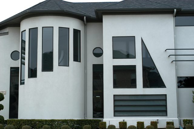
COMPOSITION/CONTENT: Very interesting house and nice capture of the image. The shapes of the windows on the house are very interesting, so interesting that they become the main focus of the photograph, rather than the squares. Since you included the shrubs and sky, I would have liked to have seen the entire roof (not cut off) and possibly more of the foreground.
CAMERA WORK/TECHNICAL: Good angle and square to the subject. The focus is a little soft and the exposure could have been a little longer. I might have used a polarizing filter to be able to brighten up the white surface of the house while minimizing the reflections in the windows.
DIGITAL PROCESSING: With some color and histogram adjustment, the green in the bushes could be greener, and the overall image could be brighter with more contrast between the light and dark areas.
MY OPINION: The subject here is fantastic. With a little post processing this image could be much more impacting. Great shot!
altho the photo itself is blah from a photography perspective -- for example it could use an increase in contrast and exposure, the building is such a find that i'm giving you a 7 :)
Love the house! I feel the picture lacks the creativity that is need in a challenge like this to get the high marks we all strive for. If this is your house, I am impressed! (7) John Gill
My only suggestion would have been to crop some of the roof and sky out and show more of the shubbery. Also, I think a different perspective (other than directly on) would have made it more dramatic. Very interesting shot, and meets the challenge well!
Very cool arraw of shapes. Doesn't look like the nicest day out. Good job cropping most of that out though. Sometimes no sky is better than white sky - Inspzil
This is a a great find. I wish the bottom had not been cropped so tight; IO think this would have allowed us to better see that the topiary is also cut geometrically. Nice shot. Jak 8
challenge met. what an interesting house, i could definitely live there :) i am not sure that i like your crop the best though. the hedge in front compliments the geometric appearance of the house well, i wonder if it had been possible to include more of it (of course i realize that there may have been other things in the way that prevented you from doing it). else, consider excluding it totally. i would have also considered cropping tighter (to the right of the protruding part with the triangle window, some more of the roof so that the sky is not visible in the top middle, and at the left to remove the parial hedge. then increase contrast to make the walls more white. i think you have a shot with lots of potential here, i'm not sure that it's been fully realized though (at least in my opinion). i have an example of my suggested crop if you are interested in seeing it. email me at franziska.lang@lycos.com if you like.





 Add photograph to your favorites
 Add photographer to your favorites

 Photographer found comment helpful.


