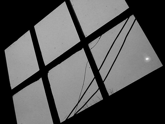
Two questions; 1) what is the white spot in the corner of the bottom pane? 2) why the angle of the window? I love the tips of the bushes at the bottom of the window. Blast those wiress. Shame all utilities aren't buried. Nice choice of B & W.
challenge met. i'm assuming that you were going for the more abstract look here, and you got close. b&W works well for that , and you have achieved very nice black in the background. there are a couple of things that you've probably included deliberately (cracks, powerlines), that i personally find a bit distracting. most of all the trees that are visible at the bottom of the window, they detract from the abstractness (is there such a word?) of it all i think. sorry.
I like the stark contrast between the black and gray, however, I think the composition itself comes up a little flat. Maybe if the light was a little more pronounced or definite, it would help.





 Add photograph to your favorites
 Add photographer to your favorites


