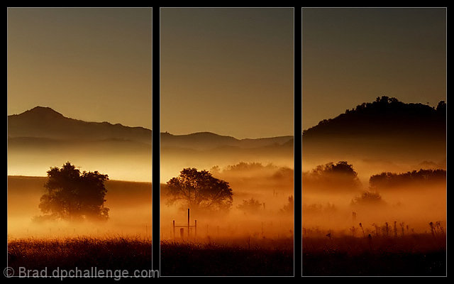
After having a lack of inspiration for this challenge, I chose to go to work the "back way" for a change and left early enough to catch the sunrise on this glorious morning.
PP was basics in curves, saturation & Neat Image.
The Triptych idea came from my neighbor's suggestion and hope the "frame haters" take pity on me - LOL!
Guess here's my "How'd they do that" for the framework.
The process was really very simple. Figure out what size of a frame is suitable for the picture. Let's say on a 800 x 500 image, a 20 pixel wide border would suffice.
Go to View, ruler and make sure your preferences is set for pixels in the Edit, Preferences section.
Go to the top left tool (Rectangular Marquis Tool) and click it. Then zoom in on the shot until you can see the pixels in the side ruler clearly (typically 800%). Click and drag a box from the top left corner, over 20 pixels, then drag down to the bottom without letting go. That will select a 20 pixel wide section down the left side and will have the dotted lines around it. Then go to Edit, Fill and select Black. Repeat all around the four sides.
(There is a shortcut to do it all at one time - select the first section, then hold Shift, and continue dragging around the outside framework. Each section will add to it, or Ctrl-A to select entire image, Edit, Stroke, Black, 40 pixels to frame entire outside all at once with 20 pixel border). Then figure out your 2 vertical divisions and drag a box down and again fill with Black. You should now have the basic 3-pane black frame. May need to zoom in a bit more now and drag a 1 pixel wide "box" along the inside edge of each pane, using Shift again to do it all in one process.
This time when done, Edit, Fill, White or 50% grayscale. If you have a dark background, the 50% gray will look kind of funny as it becomes transparent. In that case, fill with White, then without clicking the dotted lines away yet, go to fill again and select 50% grayscale. If the gray looks too dark, you can go to Edit, Fade Fill and adjust the slider bar until you get the shade you want.
Statistics
Place: 3 out of 487 Avg (all users): 7.2088 Avg (commenters): 7.7727 Avg (participants): 7.1070 Avg (non-participants): 7.8529 Views since voting: 24165 Views during voting: 458 Votes: 249 Comments: 97 Favorites: 162 (view)
Super work! The framing? I'm ambivalent, but I do think that it helps to bring focus to the shot more, so success! I really love your colors and mood here.
I love the image, the frame works really well. the tones and detail are beautiful
Congrats on your ribbon
I must say though your explanation of how you did your frame lost me I love that sort of work and I admire people who can work that out
Great work
Congrats on your yellow ribbon! Without this frame type I guess I would be saying "congrats on your blue ribbon".
The original image is just outstanding and I would most certainly have rated the highest in this challenge. It's not bad this way, but it's better the other way imho.
The frame work is outstanding. It would not have been the same for me, without it. Not only is the picture amazing in its colours and tone, but the framing gives it a very nostalgic effect, very close to Japanese art, where they often use the same framing effect.
One thing i tried here, was to change the stroke's colour to a golden/orange instead of the gray. Found it gave the artwork a little more punch. 9 on me mate.
I'm confused by this though, what is the difference between a photoshopped triptych and the shot that got dq'ed from the window challenge that had a photoshopped window frame? You didn't after all shoot a true triptych and this is a photography site, not a photoshop site...
Perhaps because this challenge does not specifically call for the picture be taken through a window and showing a frame?
Great job Brad! This was one of those thumbnails that jumped out at me as a winner.
I did not see/vote/comment on this shot during challenge due to time contsraints (I was the one that petitioned for a longer voting period due to number of entries). I'm confused by this though, what is the difference between a photoshopped triptych and the shot that got dq'ed from the window challenge that had a photoshopped window frame? You didn't after all shoot a true triptych and this is a photography site, not a photoshop site...
TC
Edited to fix a typo and add: This came off kinda confrontational and it wasn't meant that way... Love the shot. Just not sure it fits the rules!
TC again.
Excellent Brad...I have seen it without the Triptych effect and it isn't as powerful as this. Good decision to go along with the suggestion. GREAT photo by itself.
Guess here's my "How'd they do that" for the framework.
The process was really very simple. Figure out what size of a frame is suitable for the picture.
Let's say on a 800 x 500 image, a 20 pixel wide border would suffice.
Go to View, ruler and make sure your preferences is set for pixels in the Edit, Preferences section.
Go to the top left tool (Rectangular Marquis Tool) and click it. Then zoom in on the shot until you can see the pixels in the side ruler clearly (typically 800%). Click and drag a box from the top left corner, over 20 pixels, then drag down to the bottom without letting go. That will select a 20 pixel wide section down the left side and will have the dotted lines around it. Then go to Edit, Fill and select Black. Repeat all around the four sides.
(There is a shortcut to do it all at one time - select the first section, then hold Shift, and continue dragging around
the outside framework. Each section will add to it).
Then figure out your 2 vertical divisions and drag a box down and again fill with Black. You should now have the basic 3-pane black frame. May need to zoom in a bit more now and drag a 1 pixel wide "box" along the inside edge of each pane, using Shift again to do it all in one process.
This time when done, Edit, Fill, White or 50% grayscale. If you have a dark background, the 50% gray will look kind of funny as it becomes transparent. In that case, fill with White, then without clicking the dotted lines away yet, go to fill again and select 50% grayscale. If the gray looks too dark, you can go to Edit, Fade Fill and adjust the slider bar until you get the shade you want.
I don't if I'll be the first to say this but... I'd prefer the whole, unsliced picture here. The scene looks simply stunning and the framing simply gets in the way. Beautiful.
Very effective use of the triptych framing. Adds to the beauty of the picture. (You see many "frames" on this site that actually detract from the picture!) Good artistic eye.
With so many entries and such high quality, I'm allowing myself 5 ribbon picks this challege and this is one of them. I like the tryptick (I also think it would have worked without it) the light is amazing in this moody shot. BOL
I like this shot alot, but I'm ambivalent about the tryp border. It's tastefully done, but my eye is continually drawn to the vertical bars and away from your very compelling and well-lit subject. For your landscape, you've captured that golden moment perfectly, with just the right combo of low-angle light and shadow, and the fog is, of course, awesome. Bumped from 6 to 7.
Mmmm interesting. First time I have seen a border like that on the site, I'm not even sure its legal but it looks good in this case. I hope you are not being voted down because of it.
Gorgeous. Love the fog and the light you captured in it. I like the trees in the fg and the mountains in the bg. Nice choice for a tripych. One of several 10's. Congrats!
This is an outstanding photo to start with. Colors are beautiful. Foggy mist well captured with perfect blend of contrast and translucency. Powerful composition with trees and hills. I am not normally a fan of borders but this border treatment really enhances the photo. Among my top picks.
are three frames legal? anyhow.. pretty great image with great colors... not sure if the three frames help or not.. would look nice as a triptych.. i guess that is what you have done here... perhaps on the wall it might be too 70's ish, or hotel artish.. but great image.. not doubt about that.
Fantatsic tones, the mood is absolutely brilliant in this picture, excellent work. The whole triptych thing adds an interesting twist also. This is one of those photos that would look great as a print that takes up an entire wall.
Looks beautifull, not shure on the border here (is that alowed?)
I think the photo is good enough to stand on it's own and doesn't need this border, then again, gives a nice effect to it...
Fabulous photo, that luminous fog is enough make even me consider waking up for dawn! The unusual framing may hurt your score, but I think I like it. I'll have to come back to this one, 8 for now. - Bumped to 9
I love the colour tones in this image & the three panels help make this one of those images that stand out in the crowd. A very cool effect. Good luck with this.
What a beautiful photo. I would have voted higher if it were not for the split. I know you were going for artsy look, but here, the photo is so good that it didn't really needed it.
Outstanding photo, I think you will score some points for the border, but also you will loose them again because of the border. I would have liked to see it just with a typical border without the two lines in the middle that makes three pictures out of one. It would have worked better as a whole imo. I think this will not be disqualified, but some people will propably request a DQ for it, I'm not one of them. Good luck with this brave attempt that doesn't work for me.





 Daybreak
 Add photograph to your favorites
 Add photographer to your favorites

 Photographer found comment helpful.


