Initial thoughts gutty submittal, meets the challenge, seems a bit soft on focus and lighting
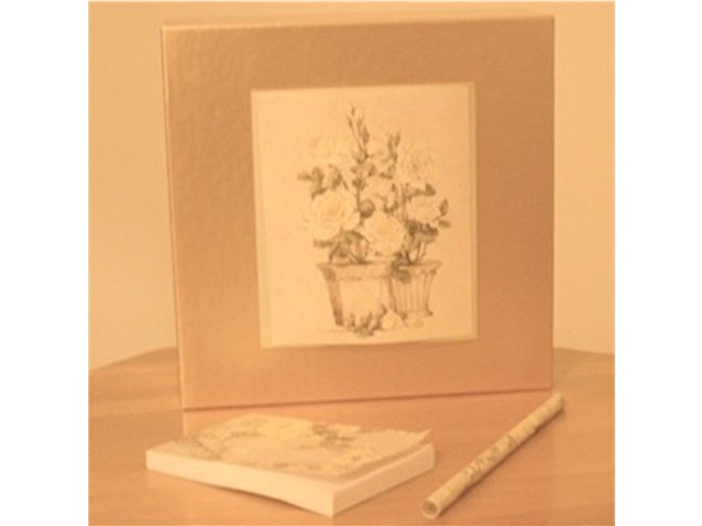
Composition/ Content I am assuming that you meant for the shot itself to be a square, thus the white borders on the side. I kind of like the softness of the shot in relation to the tones and focus. I know that it didn't do well in the challenge but that is kind of to be expected. With a bit more color I think this would have had a greater impact. The triangle formed by the picture and the pencil and pad leads you nicely to the subject.
Background Pretty much the same color as everything else in the shot so it is not a distraction by any means.
Camera Work - Technical It's hard to tell about the focus because of the low light. I feel as if it was meant to be soft anyway.
Digital Processing - Technical I don't like the white "on the sides only" border. I feel it makes the shot appear unfinished.
Fits The Challenge Definitely fits the challenge well.
My Opinion On The Photo I originally scored this shot a four as did the vast majority of the voters. I would actually like to hear a little about your thinking on the shot and the idea behind it. It may be a shot that you like but didn't do well with the voters. There is certainly nothing wrong with that. As one of your commenters said, "Keep Shooting!"
I would be happy to talk further about this shot if you would like to contact me.
DougPaz
the focus in this image is way off. It would also be better to fill your frame with the image, rather than frame it on 2 sides with white. :( Keep shooting though.
Composition: Photo frame angle looks slightly wrong.
Technical: Nice colour and lighting. Focus isn't great, but this doesn't detract from the pic too much. Was the white area around the pic intentional?
Meets challenge: Yes
Overall impression: 6
I think this photo would be much better in focus. You have a good handle on colours however, and you've used that very well in your photo. I don't like the white bars on the side however.
I think some more contrast would ahve helped this picture be a bit more attention grabbing. All of the colors are so similar and muted it seems kinda flat.
Very interesting take on the challenge, I hope everyone gets it. I like the softness of focus but not sure if the colors are right. I give you credit for creativity and guts for submittal. Good luck in the challenge.
I like the image and the warm tones, although I find the focus a little too soft. I'm not sure if the white bands on either side are to make the image fit the size requirements or you added a type of border, but I find it a little too distracting.
How do you find anything in your house? It's all camoflaged!
A nice gentle image. Composition is good but too centered for me. A square border would have helped a lot.
Nice still life, I like the unobtrusive colouring very much. Unfortunately this shot is completely out of focus. Perhaps this is a part of your composition and well considered. But IMHO it works not very well. Nevertheless good luck for the challenge!
Interesting. The soft focus works for this subject. It's a pity about the border. I think you needed to have at least a couple of pixels of border top and bottom.





 Add photograph to your favorites
 Add photographer to your favorites

 Photographer found comment helpful.


