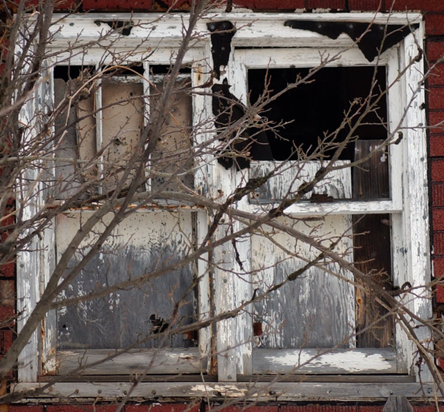
Composition - Firstly it does meet the challenge. In fact, it has about 4 squares including panes of glass too. This is a pretty good picture. Its not anything flashy or anything blowing me away, but is technically solid. Without the branches in the way, it would be just plain dull. With branches, it adds to the feeling of abandon by looking overgrown. If it were me, I would've tried to take this from a different perspective. I'm finding in this challenge I'm looking for things leading me to the squares as much as the squares themselves. There were so many tight crops on square objects that were much less appealing than your pic. The little bit of tarpaper around the windows is a good touch. However I don't like the picket down on the lower right side of the pic as it disrupts the continuity of the square's frame (the house). It's not an award winning composition, but it is solid.
Photography - Great DOF (at F11 of course it is). Exposure is just right and its well focused.
Processing - I would've considered greyscaling this image. You aren't going to lose a lot of color and it may have added some points for overall mood of the picture. Maybe even something radical like negative would've given this a little more eerie feeling. Nothing HAD to be done to this image though. Looks like you took care of that with good sound photography.
Overall - This is a sound picture in a challenge that I felt overall was pretty weak. The tree could be distracting. I can see it either way. I personally like it there. It is well taken, but I think it needs a little kick to give it the WOW it lacks. Good luck with where's waldo and perspectives. I look forward to seeing more quality pics from ya! - Bob
A good rural flavoured shot with all of the necessary elements tucked beautifully in a tight frame. The gentle grey tones broken up by the foreground bush are great. Character that you can sink your teeth into in this image. The pitch black has a real visual punch. Some folks may banter for a touch of more elbow room around the window. A minor personal quibble. A good solid image.
I love the old building shots. The branch in front of the window adds character. Thank you for doing it in color. If I had a complaint it would be that I would like the red brick to show just a little more to frame the window a little better. But that's not really a complaint, just a personal thought. It's a beautiful well done photo.
This image has great character. A lot of the time that's the hardest thing to find in a photograph, you did it quite well here. Did you try this in B & W? Just wondering.
Good shot. The branches clutter the subject a little too much for my own taste. I am drawn to the RHS of the window frame, where the edge of the window is not parallel to the edge of the picture - perhaps a larger crop area wouldn't make it so obvious? It would have put a little more colour in the picture too.







 Add photograph to your favorites
 Add photographer to your favorites


 Photographer found comment helpful.


