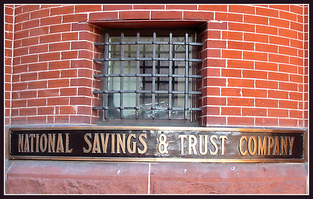
Seems a little slanted. I like the framing of this though. The bars on the window are great, and the curve of that wall has a cool effect on the composition. The bricks are a lovely red.
The lower right corner seems to be washed out a little from the light and where the sighn meets the brick is crooced just a little. I wish there were somthing more to draw my attention.
I don't know the saying so I don't understand the title. That has no affect on my voting though. I will say that the glare off the &Trust is quite distracting but other than that a nice photo.
An interesting shot with the repetition of pattern in both the bricks and the ironwork over the window. Pretty good lighting, and the composition isn't bad, though the photo does look a little crooked.






 Add photograph to your favorites
 Add photographer to your favorites


