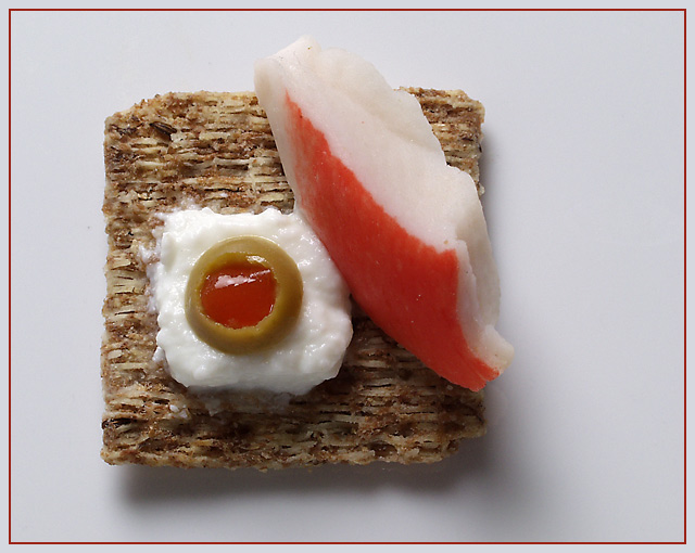
this is an improbable canape. i used yoghurt for the white stuff . and no one would eat an olive with krab. it's all for visual effect .. i wish i had something green like a scallion for the right side , as a visual offset :P
small aper to increase DOF.
Statistics
Place: 45 out of 179 Avg (all users): 5.6769 Avg (commenters): 6.6667 Avg (participants): 5.6460 Avg (non-participants): 5.7195 Views since voting: 1451 Votes: 195 Comments: 17 Favorites: 0
(1) COMPOSITION (CONTENT) I find the layout of this photograph to be very strong. The square is off center in its placement just enough to add visual appeal rather than being static. I find the diagonal line of the krab and the roundness of the olive to be a very pleasing change from the straight lines of the square. This is dynamic to the eye.
(2) BACKGROUND The background is very plain, which make the colors and textures of your setup really "pop". Perfect background exposure.
(3) CAMERA WORK ,TECHNICAL The focus is very crisp. Good exposure and DOF. The slight shadow behind and under the cracker add a certain depth to the photograph as well. There is not much that I would change about this.
(4) DIGITAL PROCESSING ,TECHNICAL Your post processing is very good. Saturation is good, cropping is perfect. I feel that the border is overkill, not really necessary and perhaps a bit distracting.
(5)MEETING THE CHALLENGE This photo does a very good job of meeting the challenge. I love the colors and the fact I feel that I can almost touch the cracker.
(6) MY OPINION ON THE PHOTO The subject here is good. The way you executed it is very good. I love the texture of all of the separate objects.
The crab looks good but I'm not too sure about whatever that is under the olive. Doesn't really look like sour cream. This is a unique idea. Well thought out and well photographed. The cropping doesn't do anything for me, one way or another. The shadow bothers me a little. Maybe some secondary light. Other than the shadow the brightness is real good. Good over all shot.
Composition: Great
Technical: Excellent focus and lighting/shadow. Pic seems slightly dark? Good choice of border.
Meets challenge: Yes
Overall impression: Really good, but would have preferred it slightly lighter personally. 7
Cute composition. Really works well. One tiny change: the background looks a bit blah, you might want to try a pure white background next time. Good job, I like it. Jacko. 8
Good idea! I would have never thought to use food to show the concept of a square. The picture is very colorful, although some of the items are not square so it sort of messes with the concept of the photo.
This is definitely the most apitizing food picture this week. Some of these “square meals” I have seen just made my stomach turn. The colors work well together, and look pretty close to my opinion of what they should. Nice texture on the triscit (sp?). I like the composition and the way the subject is slightly off-center. I personally would do without the border, I think they are way over-rated, but this is a good stong entry for me. Definitely this picture is in my top ten for this week. I’ll have mine without the olive though!






 Add photograph to your favorites
 Add photographer to your favorites

 Photographer found comment helpful.


