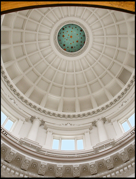
First, I have to say I liked this photo right away, the first place my eyes went to was the green "starry sky" in the middle of the dome. I also noticed how well it was focused and how the lighting was perfect.
After that I began to see ways this might have been a better photo. Was there any way to avoid the wood section at the top of the photo? It seems to distract. Was there a way to get a wider angle of the dome? Maybe to get all of the dome in the photo instead of part of it. I don't know, maybe your camera would not accomadate that, or maybe it was just not your intention. Overall a nice shot, I would have been proud if it had been mine.
Very grand. Are those stars always there at the top? Looks a bit.... odd. And what is that at the top edge of the photo? The composition is nice and the lighting is beautiful and diffuse.
I'm on my second look at this, and have to tell you that I will be rating it higher. The composition is wonderful, the whole photo is sharp and clear, really bringing out the incredible architectural detail. The lighting is wonderful, but then I am assuming that the lighting was already done for you!! A plesure to look at, I hope you place very high with this.
I'm trying to determine if the "yellow" along the very top of the shot disturbs me or not -- I guess if I have to question it, it does somewhat. I do like how it echoes the color of the stars at the top of the cuppola, but I think it might have been more effective to leave it off. Which, admittedly would have thrown off the rest of the composition unless you moved a little more to the center and got a bit more roof along the top of the shot. Otherwise, the right to left symmetry of the shot works well as does the verall exposure.





 Add photograph to your favorites
 Add photographer to your favorites


 Photographer found comment helpful.


