Challenge:Windows and Doors (Classic Editing*) Camera:Canon EOS-D30 Location: God, where wasn't it shot is simpler... LOL!!! Date: Jan 26, 2003 Aperture: All of them ISO: 100 Shutter: 1/500th to 1 second Date Uploaded: Jan 26, 2003
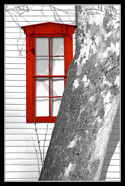
Nothing in this image is original. The House was one shot, the window was another, the tree was another, the image in the window was another, the shadows in the window were created and the tree branch shadows were freehanded. I figures since the rules were recinded for this one I might as well take advantage of it... LOL!!!
Statistics
Place: 14 out of 86 Avg (all users): 6.4787 Avg (commenters): 7.4667 Avg (participants): 6.3485 Avg (non-participants): 6.7857 Views since voting: 1487 Votes: 94 Comments: 18 Favorites: 0
Sorry for the random stream-of-consciousness type critique, but here it is.
Why does this photo make me uneasy? I really like the bold red and the shadows along the top. You did a good job of putting the pieces together. The "hole" in the tree at the top right corner is a bit weird. Even if that's how the real tree is, I think it woulda been better to have it solid in this shot. I also like the reflection. You obviously did quite a bit of work on this. IMO, it sort of gets away from the whole idea of a photography challenge and enters into digital art, but it was legal in this case. The black border works well. The lighting is just so bright - it's uniform on all the objects, but it makes the photo so stark and cold.
This reminds me of the new digital cartoons that look so realistic and sort of mess with your perception of reality. I like the diagonal of the tree and how its texture contrasts with the uniformity of the siding on the house.
Overall, it's an interesting shot that was well received for good reason. You obviously know your editing software.
Must be lots of folks like this kind of photo with objects in front of the subject.
Actually, with the shadows of the small branches at the top, the trunk 'fixes' this photo for me. Your viewing angle is just right too by cutting off the lower right of the window the perfect amount. After looking closer, I like it a lot.
Absolutely love the window, and the shadows of the branches! Terrific lighting for the shot. The tree trunk ruins it all for me, though! I would love to see a shot of JUST the window and the shadows. Cool idea though.
Very artistic interpretation of the challenge, like the use of desaturated area to emphasize the window. I think I might have liked it better without the patterning in the window panes as it's hard to figure out what that is about.
I love the colour processing on this. The composition is also very strong. I like little touches like the twig shadows and the reflections in the glass.
Like everything about this picture. The simplicity of it all really works well as does the color. The shadows, texture of the tree, very good eye. Good luck. (9) John Gill
This tree looks good in this picture, just not in front of the window. I like the color of the window, but not the desat on the rest of the colors. - Inspzil





 Add photograph to your favorites
 Add photographer to your favorites


