What I like:
-Well the title and the picture are always one. The picture alone wouldn't be understandable but with the title it makes sense. Always the whole information comes form the shot and the text.
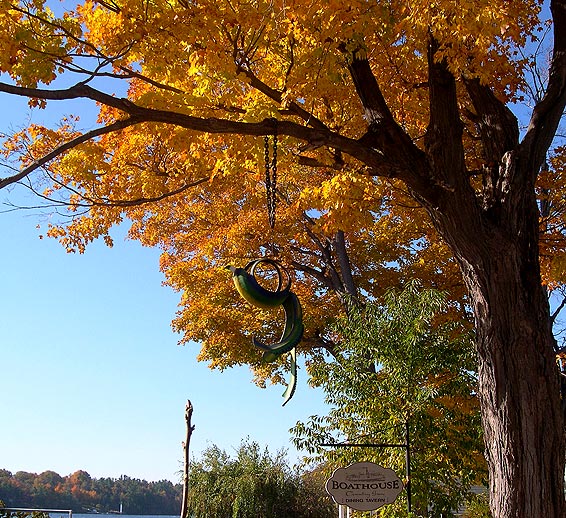
-I like the colours, although they strike my eyes a bit.
What i don't like
-Well i am guessing there was some post processing. I guess you croped the pic a bit, if you did that why couldn't you eliminate this wood in the left botom hend corner and the sail.
Photo is pretty crisp and clear. Good details. I like the concept of fall colors/leaves, however, I find this example a little bland. I think there could be better shots with lots more color showing.
I would have like to see if you move a little to the right in order to make the orange leaves the tail feathers of the bird and move up and cut the sign out, but i like the deep color in the top of the picture





 Add photograph to your favorites
 Add photographer to your favorites


