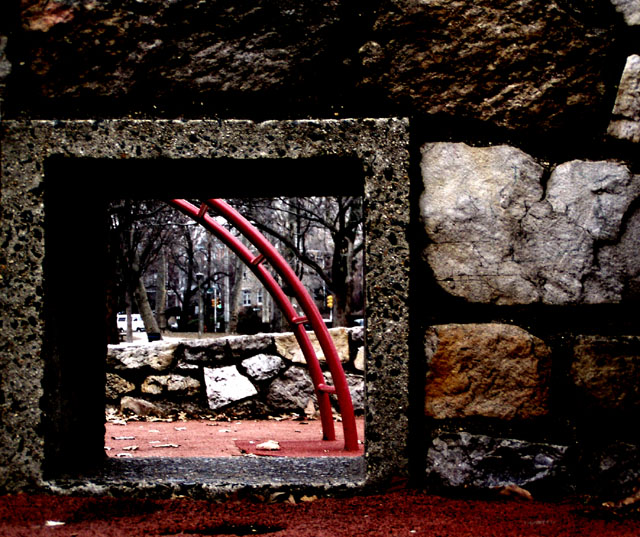
Challenge:Square (Classic Editing) Camera:Olympus C-720UZ Location: Clark Park, Philadelphia PA Date: Jan 26, 2003 Aperture: F3.2 ISO: 200 Shutter: 1/40 Galleries:Abstract, Urban Date Uploaded: Jan 26, 2003
Greetings from the Critique Club };-) I noticed that this was your first entry, congrats on a fantastic first shot.
Initial thoughts Wonderful composition, more than meets the challenge.
Composition/ Content I was excited when I recieved this to Critique as it was by far one of my favorites this week. The composition is excellent. I really like the offset of the windos in the wall. I like the texture against the opening and the flash of red through the window. The only nitpick I have is that it might be very slightly leaning to the left.
Background I like the muted tones of the background and the way they make the playground apparatus stand out. Because of the relaxed rules for this challenge, I might have cloned out the yellow traffic light to leave the red really stay the focus of the shot.
Camera Work - Technical Focus seems good but could have been just a wee bit sharper. That and some additional contrast would have been nice but may have been unatainable under the light conditions.
Digital Processing - Technical Seems good. A thin white followed by a black border may have been nice.
Fits The Challenge Definitely fits the challenge well.
My Opinion On The Photo I originally scored this shot a nine. It was one of my favorite shots and has a haunting quality that I feel is hard to capture. I think that it meets the challenge well and for a first entry is probably pretty scary to the rest of us! Great job, welcome, and keep up the good work.
I would be happy to talk further about this shot if you would like to contact me.
DougPaz
I really liked the composition and wanted to rate it higher than an 8, but the high contrast put me off - I coudn't see enough detail in those great rocks.
The thumbnail is very deceiving. I love this. Great composition with execellent execution. Wonderful photograph. I like how the square is offset from the center of the photo. Works beautifully. I love the other rockes. Great photo. It's a 10
Composition: Excellent
Technical: Great focus. Maybe slightly dark, but I don't think it's detrimental to the pic.
Meets challenge: Yes
Overall impression: Nice idea and shot, good tech. 8
This square is a great frame. The picture beyond is not super exciting, but not bad by any means. The large stones in the wall next to the opening are very cool. Reminds me of an album cover or something. Very well chosen and good job executing the shot - Inspzil
Cool boxed in world concept. I like it. My sentiments exactly of crushed in urban crunch. The zing of red adds vibrant life ands nicely contrasts to the torment of vertical and horizontal elements. The brutal ominous shadows surely add to the claustrophobic feel. Excellent foto!
Great photo. Makes you want to keep looking closer and closer! Excellent composition, colors, focus, and definately meets the challenge. Have to give this a 10!
great peek at the park..like the colors of the stoneworks and the depth achieved going across the street. The curve of the "ladder" contrast nicely with the squareness of the rocks.
Nice. It's very clever to create depth, which is rare in this challenge, with the square frame. I would crop a bit more left to give some space for outer square frame.
One of my favorite shots this week. I keep coming back to it. It is sort of haunting in a way. I like the composition and the color. Perhaps just a bit more contrast. Great job.
I really like the "doorway" and the contrasting colors and shapes on the other side. The detail you have captured on the stone is great. Your mark just went up!!!






 Add photograph to your favorites
 Add photographer to your favorites

 Photographer found comment helpful.


