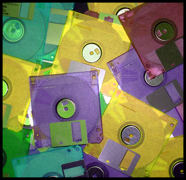
I like the random splash of CD's. The odd brightish highlight may offend those purist nitpickers but not me. Some of the metal parts of the CD's have really cool colour tints, which I personally would like to view more of. Like the funky color thing. As a wee suggestion I find that reds are real eye grabbers and I tend to use them sparingly as accents in a composition. Hence that burgundy square in the top right is hauling my attention more so into that corner. Otherwise a reasonably good image.
Composition: Good
Technical: Nice choice of layout. Focus isn't bad, but the pic seems noisy, and lack of vibrancy lets it down slightly.
Meets challenge: Yes
Overall impression: You were unfortunate to pick a very common subject, meaning you had lots of comparable competition. 6






 Add photograph to your favorites
 Add photographer to your favorites


 Photographer found comment helpful.


