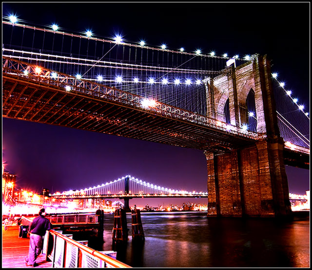
Absolutely beautiful photo in every regard. I love how you handled the exposure and whatever processing you did to accentuate the harsh lighting and contrast. Really great job.
If I'm being completely honest, I think this would be a much better image without the whacked out colors. I like the longer exposure and the comp. Gave you an 8.
The levels/contrast adjustments are obviously overdone on purpose. The resulting effect is great on the bridge. What bothers me is the effect on the city lights to the left - the eye is drawn to the blown out neon and away from the bridge. I think it would be better without the guy too.
I like this one. The star effects on the bridge lights make the picture better than most. I can't decide whether the color scheme fits or not. The title implies that I'll see motion; where exactly?
conceptually, this is a wonderful image. the colours are striking, quite surreal and very dramatic. the guy doesn't detract from the overall effect, though i think it would help if he was a little better defined. the glow of the lights and the angle of the shot are also excellent. it feels a little bit strange though - for example, the brickwork on the brdge doesn't look quite right (perhaps it's the result of over processing / editting?) this is still incredibly likeable. 9.
Looks like a long exposure with a very small aperture to star the points of light. Very nice. Perhaps a tad over sharp and over saturated. But then, that may be exactly the artistic effect you were going for. I like it. Good luck in the challenge!
The bridge part of the picture is great the lower left corner is too bright and distracting. Maybe using the burn too to lessen the brightness of the lower left corner would help. 7 Kevin
Great shot! But the strange colours on the man in the photo is distracting. Would prefer to take the man away, and crop a bit tighter at the bottom. But that's me.





 Add photograph to your favorites
 Add photographer to your favorites

 Photographer found comment helpful.


