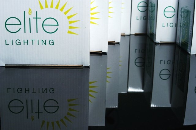
Composition: Great horizontally. Maybe a bit more of the subject (rather than reflection) vertically?
Technical: Spot on, although reflection is a little dark. Possibly couldn't improve this?
Meets challenge: I was thinking 'No' until I looked at the reflection. Some may miss it I think.
Overall impression: Everything there, but composition lets it down a bit. 6
Did you try this in a vertical orientation, maybe without the boxes at R? Not seeing any of the boxes in full gives this image a very cramped, cluttered feel. The lighing is odd, too. the three boxes in the background (L) are better lit than the one up front. I see what you were aiming for, I think, but I don't think this is quite it.





 Add photograph to your favorites
 Add photographer to your favorites


 Photographer found comment helpful.


