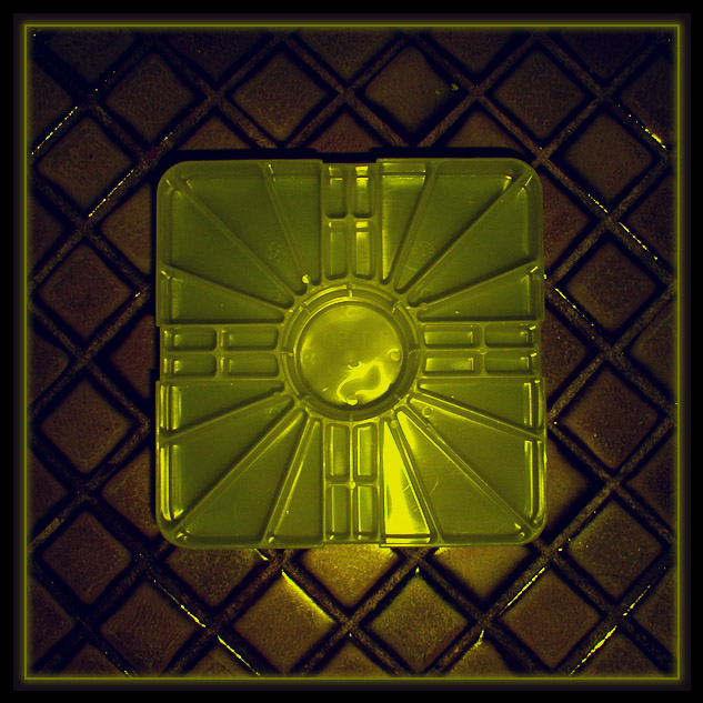
I highly agree with one of the comments you received this week about making this a black and white. The patterns that are available in this image coupled with some directional lighting from one side would create some great shadow effects that would work well as contrasts in black and white or duotone.
The overall image is slightly dark for my taste. The darkness is absorbing too much of the detail of the texture in this image. The texture seems to be the dominant factor in this image and I believe that highlighting that in your exposure would be very pleasing :)
The centered composition works well here. I don't believe that any other particular composition would be as strong as this one...
What an interesting item, is it actually that color or did you use a filter? This picture is one of the few that grabbed my attention this week. The background is a bit dark, but not too dark I think. The color works well for me, and the texture is pleasing. The shim looks like it was just kind of tossed down there, the composition might be helped if you set it slightly off center. I don’t find the border adding much to the picture, and if it were my picture I would not include it. The lighting is nice and overall I think you have done a good job with this one.








 Add photograph to your favorites
 Add photographer to your favorites

 Photographer found comment helpful.


