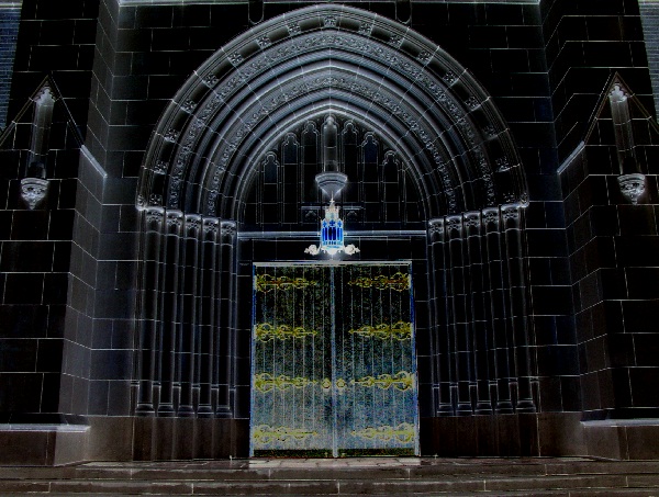
Composition (content) Very cool effects here and a composition where centering it works because of the great balance between left and right.
The effect of the blue lamp is great and it is wonderful to see how it seems to throw some blue illumination on the arch and door. The yellow/gold on the hinges pull back the attention to the door. Good job.
The situation doesn't seem level with the horizon. It could possibly benefit from a small rotation to the right. In PS you could use the ruler to decide between which points the horizon should be and level it with arbitrary rotation.
The photo shows distortion (The right and left wall tilt into the picture) caused by using a wideangle lens from closeby. I don't criticise what you did, because I think it looks pretty cool, but when you wan't to avoid that distortion there are two options (three when you count in perspective control lenses) that might work.
1) Stand back and zoom in
2) Try to get the lens at the same height as the center spot of your photo
Camera Work (Technical) Good focus and sharpness, altough some of the details have been lost in the resampling proces.
When you had trouble with motion blur/camera shake at 1/20s try aperture priority next time with an aperture of F5.6 or F4. The situation doesn't really need the wide dof of F8. F5.6 will get you a shutter of 1/40s and F4 1/80s.
Digital Processing (technical) No further comments.
My opinion The most beautiful part is the arch with the lamp. Just a crop of that would be awesome but not suitable for this challenge.
Is this building really black. Beautiful archway. Such beautiful workmanship, paying attention to every detail. Personally I would have liked to see as much above the archway as you have below the doorway. Still a nice photo.
Wow, cool processing. The composition is lovely. The shape of that arch is really effective with a bit of perspective on it. No doubt it was designed that way by the architect :).
Not nearly enough tonal range for me - very, very dark throughout. However, it's a very interesting shot, and that small bit of blue is terrific. I REALLY wish I was able to see more detail in the shot, it looks so cool.
The church is absolutely beautiful! The composition takes away from the overall image. One of the rules in art/photography is never have your point of interest end at the edge of the paper. In this case we should have seen just a little more above the apex of the entry way. Another hint I try to give my students is to never shoot straight at an object, even a slight angle will add more to the pictures creativity. Still a nice image and well taken. John Gill
This is a wonderful piece! If not inverse coloration, it seems close to it. The doors seem grainy, but I think that's your post processing. The arches above the door are perfect! I think I could have lived with the bottom of the doors being the bottom of the photo and (impossible wish) the little bricks in the upper corners, but what are you to do? (Maybe a higher, more straight on shot???) 9 Swash





 Add photograph to your favorites
 Add photographer to your favorites


 Photographer found comment helpful.


