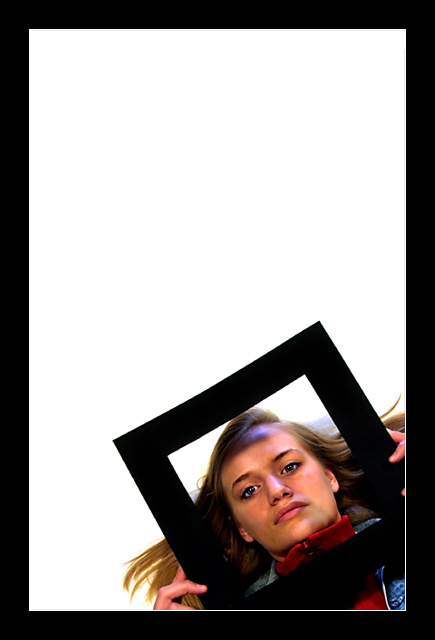
This image has your distinctive use of negative space, where you leave a large part of the frame empty. It's an interesting effect. I also like how both of the frames are the same color. And approximately the same thickness.
In this case, you make an interesting statement by combining a frame within a frame. This time, the frame inside is tight around the model's face, yet she controls it, she applies it to herself. Does this mean that we are all in control of how we present ourselves and in reality we are all living within our own, personal "frames"? A thought provoking image.
I really like this a lot, the colors are superb. I wish she didn't have the shadow on her forehead and if you were going to crop out the bottom corners of her square, I wish she would have held her square there so the fingers would have been cropped out. Really good job.
Photo is well done technically and pleasing to look at. My big problem is way too much empty space for me personally, and I know this was your personal choice. I would have been happy with it cropping off the top corner a little. That too me would have been much better and a score of 9 from me.
I really like the juxtaposition of the angles which is what makes this image work so well. And the lighting is excellent too. Interesting framing (I do not mean the border) and composition as well.
This is my favorite of this week's challenge. Very clever indeed and well thought out. wonderfully placed inside the frame as well. That's really thinking outside the box (or perhaps insdie the box, in this case). Good going.
There's that cute girl again! I can't remember who takes these shots. Enough about that. I really like the simple yet very bold composition ... it works very well, even with all that negative space. Good job. Jacko. 9,
Composition: Excellent
Technical: Lighting of model slightly lacking?
Meets challenge: Yes
Overall impression: Stunning pic. Brighter clothes/hair of model would make this perfect. 8
I gave some thought to this concept, but I didn't have anything to make a square frame with, and my kids wouldn't cooperate for me anyway. Great job on placement in the image, technical aspects are all perfect. I feel a different expression on her face would have given the photo more interest, though. I really like the inner, thin white border. It just blends in with the photo, except at the bottom right. It really accents the image subject. That's the best use of borders I've seen yet on this site!!
Congrats to this highly impressive shot! I really like the composition and the idea with the frame around her face. The width of this frame is harmonising perfect with the border of your photo. Only one single mistake I saw after 2-3 minutes: There is a hard shadow in the top of her face, caused by the frame. Nevertheless an outstanding awesome shot and my only 10 this week. Good luck!
Nice use of a border that adds to the frame she is holding. I think the white part of the border should have been removed though as it is only visible in the corner. It conflicts with the lack of a white inside edge on the frame she is holding. 6





 Add photograph to your favorites
 Add photographer to your favorites


 Photographer found comment helpful.


