Initial thoughts Interesting composition, I like the sepia, perhaps a bit dark
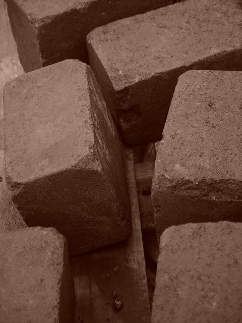
Composition/ Content First of all, I could be wrong, but I don't really think you care as much about your score as much as you do what it "feels" like to you. I find myself being drawn to the conjunction of the two bricks in the top center of the photo. There is a large chunk out of one of the bricks there. I wonder what you want us to see and feel with this shot. I like the way the bricks are arranged but feel a bit lost when I get where I think I am supposed to go.
Background I like the wood under the bricks and think it adds to the photo.
Camera Work - Technical It seems as if the entire shot has a sort of soft feel (hard to do with bricks!) and I think the focus goes along with that.
Digital Processing - Technical As I said, I like the sepia but I wonder if this would have worked a bit better with a little more light and perhaps a bit more contrast.
Fits The Challenge I think it fits the challenge but I noticed that several voters thought this too "rectangular".
My Opinion On The Photo I originally scored this shot a five as did most of the voters. I may have scored it a little low but I think that is easy to do with 179 shots to vote on when this one takes a little more time to absorb. I think that it meets the challenge well and probably should have finish ed higher than it did. Good job, and keep up the good work.
I would be happy to talk further about this shot if you would like to contact me.
DougPaz
When one says blocks I automatically think wooden. These appear to be concrete or brick. Is that why you chose sepia tone? Doesn't really matter the material I guess. Good focus, clear and sharp. Needs to be just a lighter for me. Still not a bad photo at all.
Nice photo. I really like the color. Although, I think that these blocks look more like rectangles than squares. It could also be a bit more creative. Nice job.





 Add photograph to your favorites
 Add photographer to your favorites


