Thanks for all the wonderful scores and comments.. :)
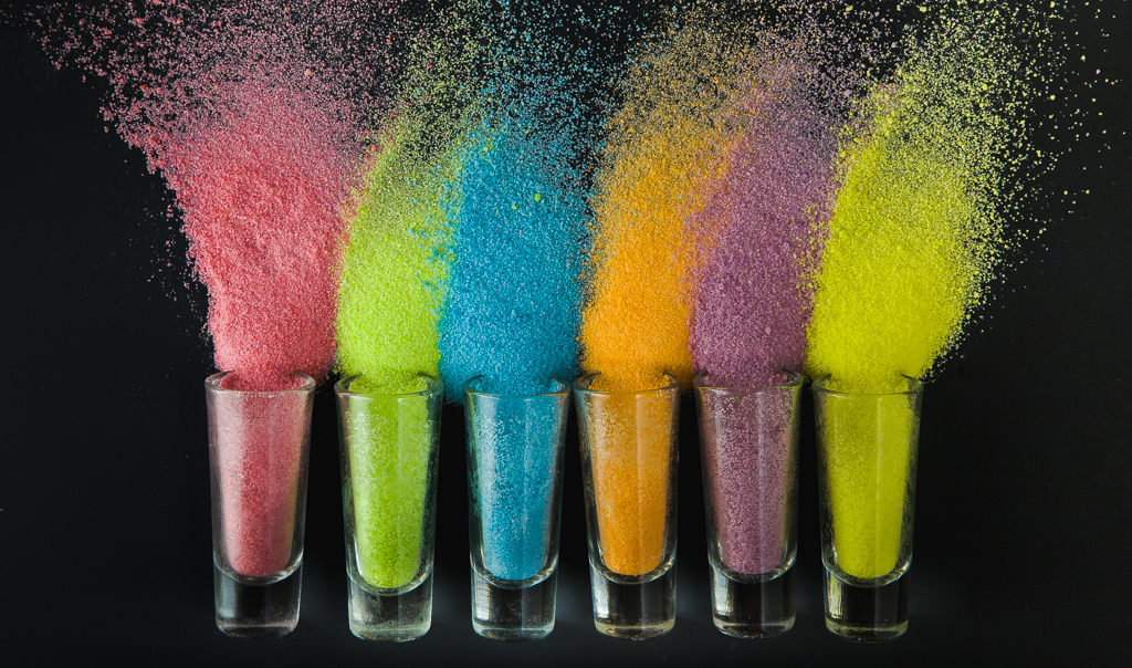
I totally understand why so many wondered why I made it too colorful and missed the opportunity to get a better score. I took and processed this shot in the eleventh hour.. literally.. :) I took this shot at 11 pm and processed it in a hurry to submit. If not, I would've taken another shot with white background so that it doesn't look this contrasty. Also the laptop in which I processed it does not have a good display. The colors seemed like it can be accepted as pastels. But the next day when I looked at it on my work laptop I realized that it was way too colorful. Usually I look at the pictures in multiple displays to see how it looks but didn't do it this time.. Anyhow I am very happy that the shot made it this far..
I liked this shot, but at the same time, seems something was missing from it too.
Not sure if it was the lighting or just the angle these were in.. :-)) Ok shot
nice setup - but I don't understand why you leave the colours this bright? for me this is not pastel - different colours, less intensive would have been a better choice if already you take the work for the setup....myopinion ;)
This is my favorite shot of the challenge but I'm struggling with it being pastel. My first impression of the image is, WOW! what beautiful VIBRANT SATURATED colors. I want to give this a 10 but will give a 7 for now for not meeting the challenge in my eyes. I may change my mind later though. Regardless, this a stunner.







 Add photograph to your favorites
 Add photographer to your favorites


 Photographer found comment helpful.


