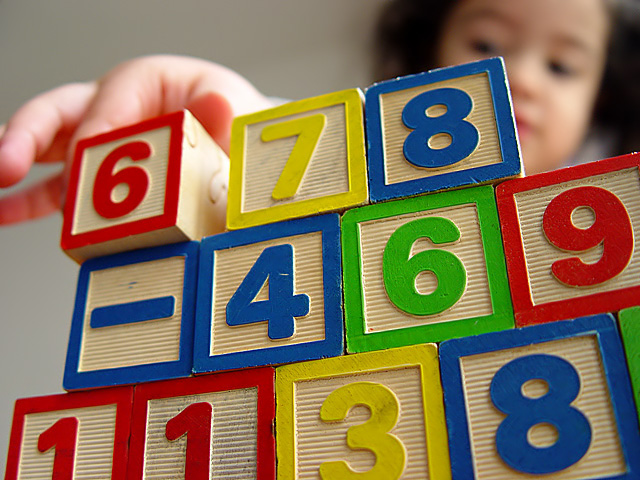
(1) COMPOSITION (CONTENT) I find the layout of this photograph to be very strong. The diagonal lines of the blocks leads the viewers eye directly to the face of the little girl. Even though her face is out of focus, it is very clearly the subject and very well done!
(2) CAMERA WORK ,TECHNICAL The focus is very appropriate for this shot. The colors of the blocks really "pop". Good exposure and DOF. There is really nothing I would change about this this shot.
(4) DIGITAL PROCESSING ,TECHNICAL Your post processing is very good. Saturation is good, cropping is perfect.
(5)MEETING THE CHALLENGE This photo does a very good job of meeting the challenge. I love the colors and the fact I feel that I can almost touch the blocks because their texture is so clear.
(6) MY OPINION ON THE PHOTO The subject here is good. The way you executed it is very good. I love the texture of all of the separate objects. This is the sort of photograph that would look very nice hanging in a childs room, or maybe a pediatricians waiting room. It is very cheerful and bright.
I just realized that I did not give you any advice on how to improve your photograph. I guess this means that I see no area for improvement. Very well done!
Great! Shows action and usefulness rather than just documenting the blocks. The child is in the right place and right dof to make this work. Perhaps her hand and the block she is holding could be in a bit better focus, and not so much the ones on the bottom. Nice job!
I like the addition of the little girl. I can't have my cake and eat it to. I like the DOF but I also would like her in focus. Your way is really best. Well done.
I love your depth of field in this shot. I spent $10 buying blocks just like these, but entered a different shot instead.
Your colors are great... very vibrant without being over saturated. I would like to have seen the little girl's whole hand on the left side of the frame. Getting the whole hand in might have been at the cost of less of her face??? Face is better than fingers, though. Nice shot, very well done. 8
JD Anderson
Great shot! I love the colors and focus. I like the angle of the blocks as well. Nice take on the challenge. I know it is nitpicking but I wish the two red blocks and two blue that are side-by-side were separated.
ok. you want it, you got it... your own private critique (without the club) and in your lenguage!
me gusta la idea. el angulo está padre y el tener a los cubos en primer plano y la niña atrás funciona. esto es lo q en mi opinión pudo ser mejor:
-yo hubier atratado de mantener a maría un poco más presente en la foto. así como está no aporta mucho. parece un error.
-merece estar mucho más en foco y sin que su cara la tapen los blocks. el hueco de la derecha hubiera sido perfecto.
-inclusive hubiera intentado algunas viendo a la cámara y/o sonriendo, como si la hubieras sorprendido.
-la mano cortada, a big no-no...
-está bien iluminada aunque un poco sobre expuesta (particularmente evidente en la mano) creo q toda la foto aguantaba un poco menos de luz.
-viéndola bien, tal vez debió tomar el bloque del medio y el 8 no devía estar para verla a ella, en foco y semi sonriendo. cómo la vez así?
antes de disparar, ve el view finder como cuando en el cine vez lña pantalla gigante y admiras diferentes áreas de una misma toma. compón desde ahí y si no te gusta, no dispares. entre menos tengas q "arreglar" en postproducción, mayor será la posibilidad de q tengas algo q te agrade.
en fin, that's just my opinio; I could be wrong. most of the time I am.






 Add photograph to your favorites
 Add photographer to your favorites

 Photographer found comment helpful.


