Initial thoughts Unique take on the challenge, balance seems a bit off.
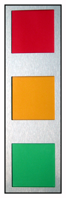
Composition/ Content This was the very first shot I saw during the voting and I must admit I wasn't sure what to make of it. Well lit and colorful but rather uninspiring. The biggest problem I see is that the red square is a little off kilter. The others seem to be OK but that one has a left hand lean.
Background The silver background is well lit and works well for the challenge.
Camera Work - Technical Focus seems pretty good but I'm not sure exactly what I am looking at. If the lighting were moved to the side it may have made for a more dramatic shot with the textures in the metal coming out more and the shadows on the edge of the colors showing a more 3-D side as well.
Digital Processing - Technical It seems a little grainy but once again, I'm not really sure what I'm dealing with here.
Fits The Challenge Definitely fits the challenge well.
My Opinion On The Photo I originally scored this shot a five as did most of the voters. I think that it meets the challenge but didn't really leap out at you and grab you. As I mentioned, even looking at it a lot for this critique, I'm still not quite sure what to make of it. Good job, and keep up the good work.
I would be happy to talk further about this shot if you would like to contact me.
DougPaz
It is straight at the bottom, but not at the top. That makes it feel kinda off balanced to me. maybe a different perspective that showed the same thing would have made the picture more dynamic.





 Add photograph to your favorites
 Add photographer to your favorites

 Photographer found comment helpful.


