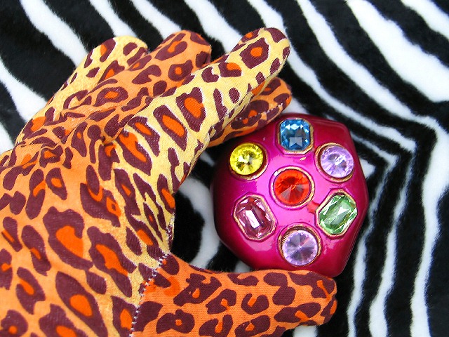
Ok shoot me, but I don't think poor taste is "poverty". On top of that, I feel the "gem stone" thingy is the part that should be in clear focus rather than the glove.
I was showing my girlfriend this site and the photo I submitted, and she loved this one most of all. She loved the irony, I love the colors and the contrast between the zebra and leopard print. Good focus, very vibrant. Kudos!
yes, yes it is! This hurts to look at! Seriously, the gem thing looks just a tad out of focus, but I like the composition and the idea behind this... I just don't like looking at it!
I don´t completely get the title, but that´s pretty much irrelevant. Good shot though but you could have included the "jewel" more into the DOF, it looks a bit out of focus.
this is a srrong well crafted image, but it says more about the "haves than the "havenots. I think that there ais a lot of garish superficial people around and you have got a good message here.






 Add photograph to your favorites
 Add photographer to your favorites


 Photographer found comment helpful.


