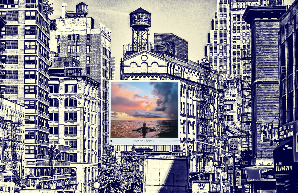
Wow. A very different take on the challenge but quite creative and undeniably interesting. To me, it's DNMC for pastels (even the colors on the billboard are mostly saturated & vibrant), but it's a great image. Gotta ponder how I'm gonna score this...
Second visit to look at this and am still confused by how this billboard hangs there like that. Maybe it's just a print stuck on your wall? I like the treatment to the image but do worry about the amount of pastel even though what is pastel is good.
For me, there is too much contrast between the way the background is processed and the iPhone photo, causing it look like the photo was cut and pasted there.
The processing will be probably be a love or hate for most people but I think it's interesting. The billboard feels like a portal between two different worlds. 8






 Add photograph to your favorites
 Add photographer to your favorites


 Photographer found comment helpful.


