Photographer’s Notes To be perfectly direct, I didn’t resonate with this challenge at all. I’m not a feather guy. Feathers come from birds. Birds have lice. Hence, feathers have lice. I don’t like lice; hence I don’t like feathers much. I understand prejudice when I see it.
But I’m game for my DPL team and I’ll give it my best shot.
And "Plumes De Poulet" sounds a lot more elegant than "Chicken Feather."
Post Processing • Convert from RAW (PSCC Camera Raw)
• V1: Clarity (PSCC Camera Raw Filter)
• V2: Anti-Clarity (PSCC Camera Raw Filter)
• Blend V1 and V2 (PSCC Masking)
• Remove Distractions (PSCC Clone Layer)
• Filter (OnOne Perfect Effects)
• Crop (PSCC)
• Resize (PSCC)
• Sharpen (PSCC USM)
• Save for Web (PSCC)
Camera Data • Date: 2015.06.17
• Camera: Nikon D800e
• Lens: Nikon AF Zoom-Nikkor 70-200mm f/2.8 VR DG IF-ED
• ISO: 100
• Aperture: f/2.8
• Shutter: 1/1000
Statistics
Place: 98 out of 169 Avg (all users): 5.3853 Avg (commenters): 5.7500 Avg (participants): 5.3780 Avg (non-participants): 5.4074 Views since voting: 457 Views during voting: 202 Votes: 109 Comments: 10 Favorites: 0
I can totally relate with you on the challenge topic, not a fan of feathers either for the same reasons.
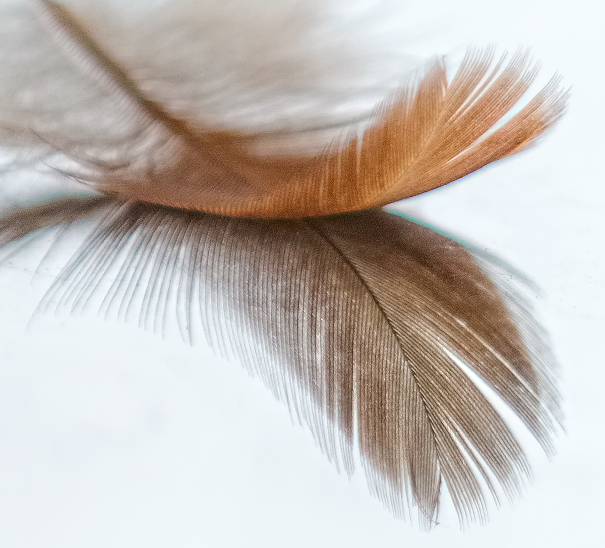
I love the composition of the delicate feather it works very well with the square crop and the colours are lovely too.
Others have commented already, but I'm quite shocked how much noise has been added during post processing. As a fellow D800 user I know that at 100 ISO you are not seeing much noise at all in a Raw file, so can only assume that this has happened is as a result of post processing.
With that lens/camera combination I would have expected the in focus parts to be tack sharp but they are not for some reason and I think that detracts. The blue/green fringing is certainly another distraction mentioned already.
Without the grain/noise issues I feel sure this would have scored a lot higher.
I'm enjoying being part of the DPL "First 10" Challenge. Yours is photo #2 in my random voting stream.
The placement of feather in the top third of the frame works nicely to give room for the full reflection and the amount of negative space white is right on. I'm distracted by the turquoise and blue color fringing and wish the whole thing was a bit sharper and not so grainy.
Composition is good. Image is over processed, especially along the edge of the V-shaped white space on right of the image. See the funky colored (blue, green) halos there? The image also has a lot of unflattering noise that isn't helping, and keep an eye out for spots and specks that can be touched up.
Images of this type are usually 'clean' and so sharp you could cut yourself on them. You've taken a done-to-death image and put your own slant on it; it's an interesting take. There is a blue halo on the right on both the feather and the reflection.
Such pretty tones - I love the golden brown against the more umber reflection. For me, the background could be cleaner and the focus sharper, but the square crop is very effective with the subtle diagonal.






 Add photograph to your favorites
 Add photographer to your favorites


 Photographer found comment helpful.


