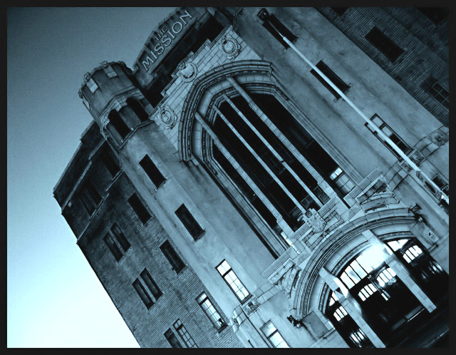
Picture of the Seamans Mission, Limehouse. I feel a bit of a charlatan because even thugh it USED to be for destitute sailors (and others) it has in the last few years been turned into (very expensive) apartments. it's still a cool (i think neo-gothic) building.
i went to bluescale because the sign at the top gets lost in colour, even though it was a beautiful early evening when the shot was taken. slightly over editted, but a new season of teachers is about to start, so time was short. i neat imaged, gradient mapped (like greyscale, but lets you use a different colour to white), contrast, brightness and curves adjusted. not in that order.
Statistics
Place: 63 out of 171 Avg (all users): 5.2974 Avg (commenters): 6.0000 Avg (participants): 5.2099 Avg (non-participants): 5.3289 Views since voting: 850 Views during voting: 416 Votes: 306 Comments: 18 Favorites: 0
hi, david. :)
i was just poking through some of your recent photos and had to comment on this one because when i saw it i said, "ooooh." literally. outloud, alone in the house, just me and the cats. so i thought you should know. i like it a lot. i'd buy the postcard if i saw it somewhere.
I really like the tones you choose for the photograph. I hope people don't blast you too much for the angle (my school days did poorly because of a steep angle).
there seems to be a sureal effect about some of these B/W shots the message is there but is negated by the beauty of this shot. cant explain it any better.
The skewed angle doesn't work for me. And rather than look impoverished, this building just looks old. Still, a good effort was obviously put into this photo.






 Add photograph to your favorites
 Add photographer to your favorites

 Photographer found comment helpful.


