Author Thread Comments Made During the Challenge
Post actions
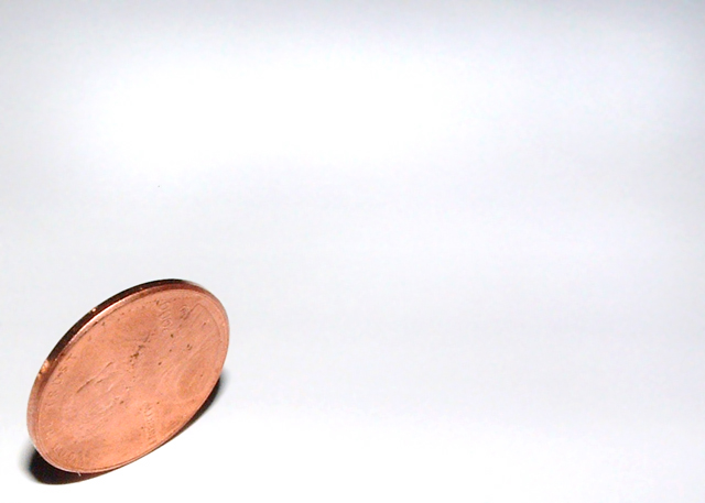
Too much light on the penny, and not enough detail. Like the concept and title.
Post actions
Post actions
I would have liked to have seen more detail on the penny, but this is a great idea, and well executed.
Post actions
I like the use of empty space - makes a good composition. I wish the detail on the coin was a bit sharper, but that might be because the coin is old and hasn't got much detail left of course. Good image.
Post actions
i get your idea, but the lighting is washing out the details on the coin. it also looks like the lighting on your shooting surface is uneven.
Post actions
would like to see it done with lighting from lower left...to give more detail to the coin face and cast a longer shadow across the area....good contrast
Post actions
Idea is surely good... just you could use the lights and angle more for your best. It would look more interesting if i could see whats on coin.
Post actions
Post actions
good idea and well thought out.
Post actions
some contrast in the face of the coin would have made it a much better photo.
Post actions
Very interesting composition. I like the simplicity of the message and shot.
Post actions
I would like to see more of the penny's detail, but otherwise, a very nice shot.







 Add photograph to your favorites
 Add photographer to your favorites


 Photographer found comment helpful.


