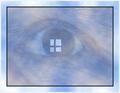
Composition : While I like the negative space here, the window looks a little too high up... Maybe a smidgen more room at the top would have helped this... Also, the windowsill looks a little slanted, although that could be an illusion.
Exposure / Lighting : Nice range here... The whites are not blown out and the darks still show detail... Very well done.
Focus : Great... No issue...
Post Processing : Great choice for duotone. Very well done too.
Neat window, lots of negative space to focus attention back up to the window. Contrast is pretty good. The shading of the blank wall takes away from the effect of offering the negative space. 6 Swash
Too much negative space. The windows are not square to the horizon either. The subject needs something to make it a bit more interesting too methinks - Inspzil
I like the use of empty space here, but I think it would be more effective if the window was placed slightly lower in the shot, perhaps a couple of degrees of rotation would help too. Good Luck
Without the title I'm not sure I'd know this is an old house. I think instead of focusing on the area below the window I would have tilted the camera up and get more of those cracks around the window. There just isn't enough detail in the wall below. Good work and good luck.
I like the direction this shot is going and I think it has a lot of promise. I think, perhaps, I would have tried to crop it slightly less tightly at the top of the shot -- match the margins at either side -- though this may not have been possible. More importantly, their seems to be something strange going on with the straight lines in the shot. The sides of the window seem to be straight up and down, but the bottoms of the window slope down to the right. I think this is an image that needs to be square all the way around -- easy to fix in Photoshop with the transform tool.
i love this composition, simple and interesting, i think it would have looked better with a sepia tone, or with an old antique yellowish tone to it. i copied it and did some color adjustment and it really came to life. great composition.






 Add photograph to your favorites
 Add photographer to your favorites


