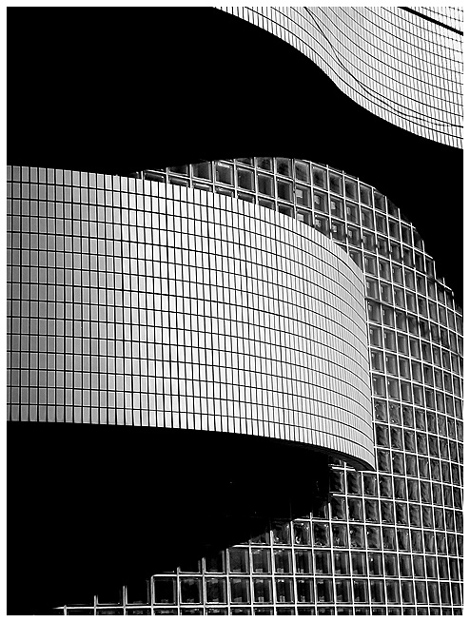
THis photo is a classic. Do you think you could have gotten any more textbook design elements into one photo? Shall I point out a few? Line? Exquisite! The straights, the curves. Leading lines? Start at the bottom, shadow leads me in, curve leads me out, swoopy shadow leads me back in, swoopy curve back out. Perfect zig zag and I've covered the whole picture. Shape? Great shapes, mirroring each other in dark and light. Texture? Yep. Pattern? Three different window patterns cantrast and complement eachother without every making the picture busy. Because they are divided by yet another design clasic, shadow. Your choice of black and white gives the shadows a shape and weight of their own, equal to the windows, used to separate and balance the square patterns. lovely. Refection? Yes, the reflections in the larger grid of windows gives them depth and helps create the contrast with the smaller grid of tiles. Perfect.
More? Theres a long list of design elements and you've got them all except color which works by it's absence. How about unity, grouping,placement, balance, contrast, mass? I don't need to point out everything. My personal favorite here is movement and rythm. your picture is like a little dance..or a flag flapping..You took a ten ton wall and made it sway. I love it! Everything in the picture works in it's own right, all add up to the whole.
I am the nittiest of pickers and I can barely see the wire some people complained ot. I think you did an excellent job of camophlaging it, and I love the dangly shadow it casts. Like a strand of hair out of place on a beautiful woman. Without that strand, the scene would have been too perfect, even harsh. A great touch. Also I can't stand an off kilter photo. You worked hard and succeeded in making sure all these tilted lines feel straight.
Technical aspects - all perfect- lighting, focus DOF- post processing, cropping border. Everythings just perfect.
You got a lot of useful comments on this photo. The best images always generate the best comments. Let me just summarize the adjectives for you. Very nice (6). Very well executed. Nice. Perfect. I love it (3). Well done (2). Really cool. Fun. Bravo. Wow. Powerful. Interesting. Great (3). Interesting. Excellent (3). Beautiful (4). Thanks. Gorgeous. Eyecatching. Wonderful(2). Elegant (2). Solid. Strong. Superb. Favorite (2). Good job. I couldn't have said it better. Clap, clap, clap. clap. Stand up and take a bow.
So what should you do now? Find some nit picky way to DQ two more photos? Then you could get the ribbon you deserve. Or get an even better shot next week?
And the usual disclaimer - remember that this is just my opinion and I am not an expert. But a lot of people agreed.
Wow, great curves and lovely high contrast black and white. I've scored a lot of photos high in this challenge, but this is another one I want to give a 10. It's just so cool :).
This is a beautiful architecture shot.. I love the patterns and 'texture' displayed on this one.. black and white accents that very nicely.. .= 10 - setzler
challenge met. what a wonderful abstract, the b&w works so well, and you have achieved a very nice tonal range. i like the curves running through the photo and the different grids, separated in places by the black shadows. there are only two nitpicky suggestions i have (and they are indeed nitpicky/personal preference). first, i would've cropped a little off the top to get rid of that wider band of black at the top right. second, i would've used a one pixel black border and then the white border to have more separation between the white border and the light (but not totally white) parts of the photo. regardless, your entry this week is in my top picks :)
this is gorgeous--very eye-catching. i cant say enough how well the angles and lines and curves work together here---you have a wonderful eye for graphics. im glad you chose B&W for this as well---wouldnt be the same in color! wonderful work! :)
Great contrast and love the sinuous lines of the shot. It makes an excellent abstract. There are nits, and I don't know that you can do anything about them, but I'll point them out anyway. All of these beautiful clean lines are broken up by that wire (?) in the upper right corner -- go cut it down. ;-) There are also some strange shadows -- perhaps cast by the same wire, or by cousins orwho knows in the window section -- these are much less distracting than that wire. There are some ways, not too hard to use, to get rid of all of those problems if you'd like some help.
Nice abstract shot. The tones and lighting are perfect. I love the flow of the curved shadows against the square of the windows. Well done, in my top 10 this week!
very nice. very well executed. i didn't feel comfortable taknig a 'building photo' because i didn't see an opportuinity for something like this, which is reall compelling.






 Add photograph to your favorites
 Add photographer to your favorites

 Photographer found comment helpful.


