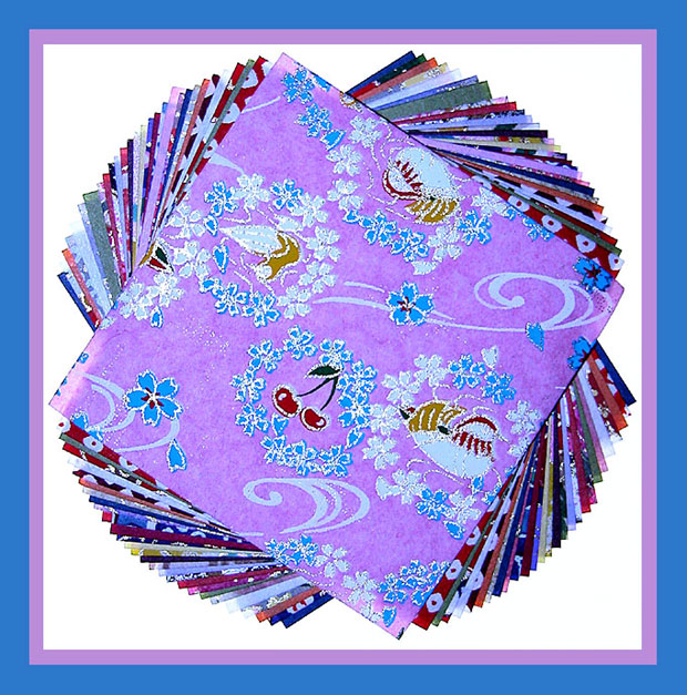
Well.. at least you had an awesome shot in the milk challenge so... I don't know if this paper was just reflective or what, but it's a little hard to look at. I like how you arranged it. It fits the challenge and is interesting b/c of the layering. It's just so bright! IMO you didn't need the border either. It's too fat and colorful - distracts from the subject rather than enhancing it. The print on the paper, combined with the lighting, looks weird. Maybe post processing contributed but I think it's a little over exposed. It's a simple shot that works for the challenge, but I'm not sure it has much long term interest or would do well outside of this challenge. You can obviously take wonderful photos so just forget about this one :P
Great shot! Don't know how you got the papers to line up so perfectly! The papers and colors are very pretty and the border choice is perfect! Good luck in the challenge!
Composition: Good
Technical: Great focus and colour. Thing the border is a little over done.
Meets challenge: Yes
Overall impression: Nice subject and pic, but a thinner border would help possibly. 6
Nice colors. Great idea. The only thing about this pic that I don't like is that its a little bright, but not overexposed by any means. It looks a pinch oversharpened too. Quality pic though - Inspzil
Nice shape and placement of the squares. I like the symetry. Somehow, and this might be just my opinion, the colours look too bluish, like the white balance wasn't set properly. It is also accentuated by the border being blue. Good luck. Jacko.
I really like how you have this design set up. I think by making a darker back ground or by eliminating some of the white you would have had a little more creativivty to your picture. Nice Job





 Add photograph to your favorites
 Add photographer to your favorites


 Photographer found comment helpful.


