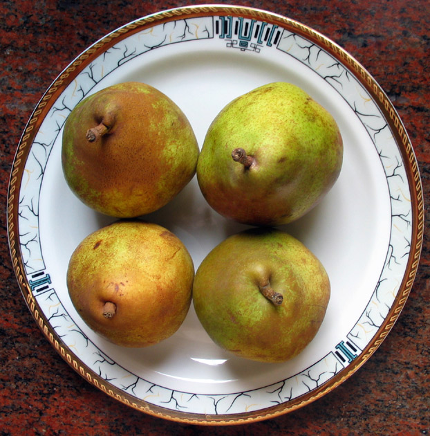
Opposition between squared layout of pears and the circles of the plate.I took the shot in my kitchen yesterday, near the window. I cropped it and make level adjusment.
Statistics
Place: 145 out of 179 Avg (all users): 4.5765 Avg (commenters): 7.1111 Avg (participants): 4.6283 Avg (non-participants): 4.5060 Views since voting: 1081 Votes: 196 Comments: 11 Favorites: 1 (view)
Nice camera :) This photo didn't really jump out at me during voting. It's a decent shot, but not the most interesting subject to me. Nothing really stands out - I don't say "wow, look at those color or that perspective or those lines or that texture". Pears are a pretty good subject actually, but I don't think that the plate helps anything. They don't even look to be centered on it. Lighting is decent tho the shadows in the center are a little dark. I think the four pears might have had more impact on a solid color bg with some dramatic lighting. The square also isn't very obvious - which probably affected the score. Keep practicing with your camera - it's capable of great shots. This one probably didn't deserve such a low score, but it's always a matter of finding the right subject.
Hmmmm - the composition is sort of square shaped, but it doesn't do much for me. Good coordination of colors on the plate rim, working surface, and reds in the pears.





 Add photograph to your favorites
 Add photographer to your favorites


