|
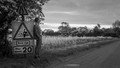
Not my favorite look for IR - a little too red but thankfully not cotton candy. Could use some perspective correction (tilted left) and a white point somewhere (feels midtone heavy). For me this would have scored well with different processing. For others I suspect, like mine, this takes hits just for being IR. 6 |









 Add photograph to your favorites
 Add photographer to your favorites


 Photographer found comment helpful.


