Wow so perfect! I like it I hope I didnt mess up by buying a fugi instead of staying with Kodak and upgrading.
Your pictures have advanced with all your upgrades. of course you have the eye too! Thanks for being a good insparation! And keep your awesome photos coming. :)
Tracy
Kylie, you are a rip. This shot is your current mascot. It is great. it is superb and so dashing. I was sure this was going to ribbon. Congratulations on your 12th placing. Feel proud.
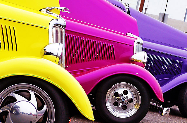
This should easily finish in the top 10, this is an excellent photo, all of the technical items are there plus interesting subject matter and great colors. 10.
returning for comments:
Forget the challenge. The colors here are so vibrant that they indeed present a feast for the eyes. It certainly meets the challenge, yet it rises higher on its own merit. Very good work. Bumping up and goos luck.
In a word - WOW!
An explosion of color and art all in one. You have captured this challenge well and applaud you for your composition and great eye and camera alignment here.
One of my favorites in this challenge and truely deserving of a ((10))
Well focused, great colors, great implied lines. The only thing I see that could be improved (in my rank amateur opinion) would be to take the shot at an angle that would allow the cars to fill the entire frame. The little background triangle at the top right corner is distracting, but certainly not enough to keep me from giving it a good score. Good luck on your entry.
A very interesting shot. Implied lines yes. Not being able to see the front of the last car is anoying, I suspect its to crop out background distraction? The background is still slightly distracting, the partial wording on the sign could have been removed I think? I like the angle at which its framed. I like tighly cropped shots that fill the frame but I think this is a little to tight and I find it slightly frustrating that I can't see as much as I would like to. A six though, thanks for that,well done.
Great color POP... unique idea, appreciate the careful alignment of the hoods (really wish you'd cropped out or blurred the background stuff -- just keeps it off my ribbon list) as presented, one of my favorites this challenge
Nice idea and colorful. I know the tilt is to add interest but I think I would have preferred to avoid the background. Might have been interesting to tilt the other way and include the more "backgroundish" pavement.





 Add photograph to your favorites
 Add photographer to your favorites

 Photographer found comment helpful.


