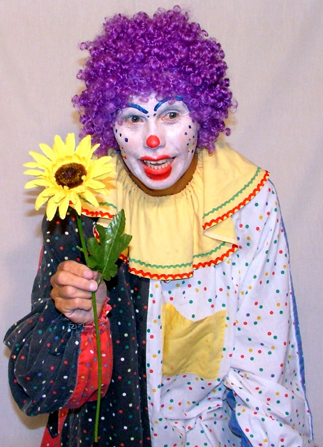
This clown doesn´t look so funny for me. Maby if he had a huge smile or just a stronger face expression this could be more intressting. Then i would have had a black or red background but that´s just my taste.
unfortunately, not in me there isn't - to be honest, I've personally found clowns excessively creepy and freak me out a little bit, so it's not a shot i would hang on the wall. I do appreciate the effort obviously employed in getting this shot done (unless the dressing up was for another reason - grocery shopping perhaps?). technically it's okay, a TINY bit out of focus (more in the clothing area, really), the pose does looks a little forced / unnatural, and i don't know, a beige / grey shaded sheet as a background doesn't really fit (circus tent would have been useful, though admittedly not very practical). I think it might be more effective if it were taken closer to the face, and maybe made B&W... however, lots of kudos to your volunteer for dressing up... 4.
the shadows kinda blow the overall impact of this shot. to avoid shadows from falling on the background, more your model away further from the background. (anywhere from 5-10 feet should usually work)
It looks like your subject was a little too close to the background as the texture/creases in the sheet has become part of the image. Having your subject step farther way and also separately light the background may have helped isolate it more. The closeness factor can also be seen with the shadows on the lower left and around the hair from the flash. The yellow of the flower looks either too bright or oversaturated. I know some people say it's best to have the subject look away from the camera but I think in this particular case having him look directly at the camera may have made him more engaging with the viewer, he's a clown after all and that's what they do. On a totally non-related to your image opinion - clowns are evil!







 Add photograph to your favorites
 Add photographer to your favorites


 Photographer found comment helpful.


