Hey Janine,
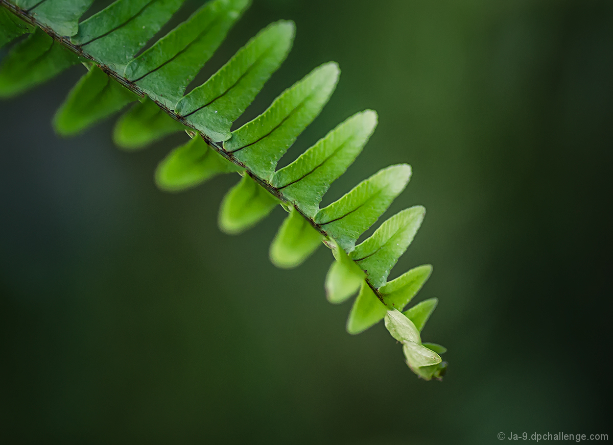
Coming to you as a Critique Club member. The current challenge queue is empty and we're taking up some of the backlog. What's fascinating to me is the score data. It's unusual to see the commenters be lower than the non-commenters. And I don't remember seeing such a big difference in participant and non-participant scores. But I digress. I was a participant in this challenge and I voted with a 6. I liked the simplicity of form and color here. The background is complementary to the subject and creates a strong separation, even while maintaining the overall green palette. I"m torn about the last empty space on the right. It gives the subject breathing room and allows the background color to darken on a left to right gradient. Without it, the overall effect would have been a brighter image. Finally, I agree with backdoorhippie's comment about the tips of the leaving not being in focus - just a tad more DOF would have done wonders. So in the end it was a six. I liked it, didn't love it.The primary down side being such a simple subject... beautiful lines and colors, but not a totally compelling subject. |









 Add photograph to your favorites
 Add photographer to your favorites

 Photographer found comment helpful.


