with a little help from annida:
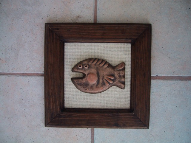
I like the idea of this picture very much. The subject is appealing, and definitely fits the challenge of square. What I think you could have done to improve the composition was to a) either put a fabric behind the frame, so it's not on the tile, or b) cropped the picture so that it was actually around the frame, which would result with a square photo as well. I think a bit more lighting on the subject would have been good as well. Maybe you could have tried a duotone, since the colouring is almost there already, and made the contrast more, with some sharpening and use of curves. I think this is a very good attempt, and I hope to see more from you in the future!
Composition: Think a different drop would be nice
Technical: Good focus. Little dark? Looks slightly unstraight?
Meets challenge: Yes
Overall impression: Nice picture, but not sure photo adds to it
Funny figure. Maybe should have played with some coloring. Needs some sort of tone, those tiles don't help much (unless you add some sort of tone, then they add texture).





 Add photograph to your favorites
 Add photographer to your favorites


