Hi Zita - this is coming as a Critique Club member - getting to some backlogged requests.
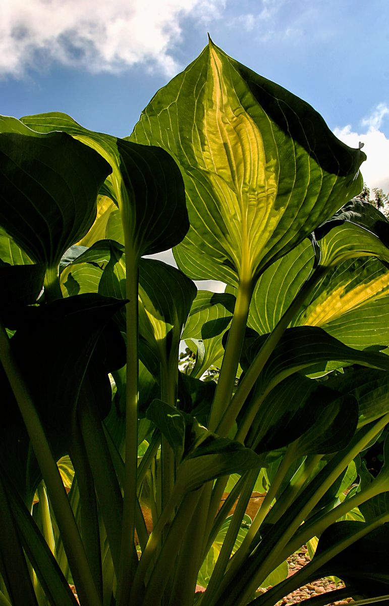
I was surprised that this didn't do better, I gave it a six and considered bumping it near the end. It has a unusual POV and the color palette (especially in the top third of the image is terrific - the yellows are perfect against the green and blue. I suspect what didn't work so well for voters was the heavily weighted dark bottom portion that is an artifact of the POV. There's also the contrast of larger dominant shapes at the top and more detailed busy shapes at the bottom. This tends to create ambiguity about where the viewer's central focus of attention should be. I liked the effect of imbalance in the two halves, it may have been distracting to others. |





 Add photograph to your favorites
 Add photographer to your favorites

 Photographer found comment helpful.