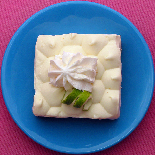
Composition - It seems odd to me that the Pie here is square. Maybe that's the appeal of the pic. The pie is good. I like that part with the lime twisty and little whipped topping and all. The plate is okay. I reckon you gotta have a plate. The pink background, which looks like a sweater to me, is one of the things I don't like about this picture. It's probably a personal thing. I'm not fond of pink either, but I can't say anything like, "Well I'm giving you a 5 because I don't like pink." That doesn't fly. But the texture of the sweater is going a little diagonal. The other thing I don't like about this is the tightness of the crop. Maybe there is a reason for being so tight on the plate, I'm not sure but I don't think it lends itself well to this picture. The perspective on this pic is really predictable, very straight and to the point. The pie, no matter what it's sitting on, still looks yummy.
Photography - Good focus, exposure. DOF is not really an issue. Nothing to speak of really here.
Processing - Even less of an issue. If you did anything to this pic, I can't tell. You might have tried to saturate the colors a little more, but its fine the way it is.
Overall - This is a cut below your normal excellent pictures. I would've been happy with a 5.5 on my pic but I'm sure you aren't. The things that keep this pic from doing really well are due to the composition. It just doesn't have the WOW factor Setzler likes to talk about. The angle and crop are just very ordinary, like something I would do. It isn't typical Indigo-type work. Look forward to seeing more from you. I'm sorry this couldn't be more help to you. - BoB
Beautiful use of colours. I can't believe I'm saying that about blue and pink, but it works really effectively. Lovely composition. great shaprness. Good luck. Jacko. 9
Oh yum. Did you eat this after you took the shot? I would have..lol. Great colours pink, blue and white. Your composition is fantastic in the way that you have placed a square object inside a round object. Very creative. GL.
I don't recall seeing anyone use a knit tablecloth before. Using a solid color instead of a pattern would probably allowed you to save at a higher-quality JPEG and eliminate some of the other (slight) artifacting.
Pretty good job handling the white on white.
And pastel!! I like the shot, the composition, and especially the colors. The only thing I would change is a little less light on the top of the cream.. Cub
Great idea, but not sure about the wool the plate is placed on - a finer textile (cotton? Filt?) would probably have been more suitable. Not a bad shot, however. (7)
Composition is excellent but there's something which doesn't seem quite right and I'm not sure what it is! Perhaps it's the shine from glaze of the bowl, perhaps it's the stitching of the pink background fabric.





 Add photograph to your favorites
 Add photographer to your favorites

 Photographer found comment helpful.


