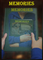
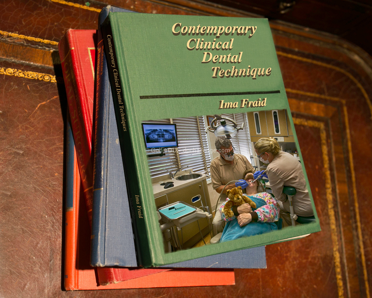
I really like your idea, but the execution makes it look too fake - it all looks too "photoshopped"...... a bit more photoshopping could have fixed that.
Just to mention one example - the text on the spine. It isn't quite in the right position (too far up), and it is way too bright. Being on the side of the book that is very much away from the light, the font, too, needs to be darker/duller.
But I do like your choice of a "carelessly" arranged pile of books. |





 Add photograph to your favorites
 Add photographer to your favorites


 Photographer found comment helpful.


