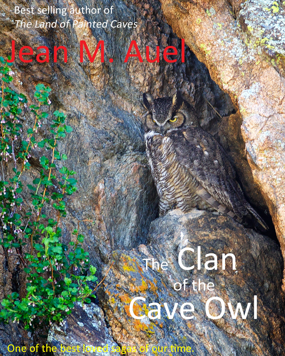
I am a HUGE fan of the "Earth's Children" series, so I really, really wanted to love your book cover.
Sadly, though, I can't. It is very difficult to look at.
I find that the photo itself is harsh (although the owl is a real stunner!), but then having so many different bits and pieces of font, in different colours, none of them standing out properly from the background all just add up to something I can't enjoy viewing.
I love the owl, I like the composition. Your choices of text (i.e. the words you used) were rather good - maybe with some different processing and a lot of font-tweaking this could turn into a great cover. |





 Add photograph to your favorites
 Add photographer to your favorites


 Photographer found comment helpful.


