Hi olbol,
This comment is part of my participation in the DPC Critique Club. There's a big backlog of images with requested critiques, sorry for the delay.
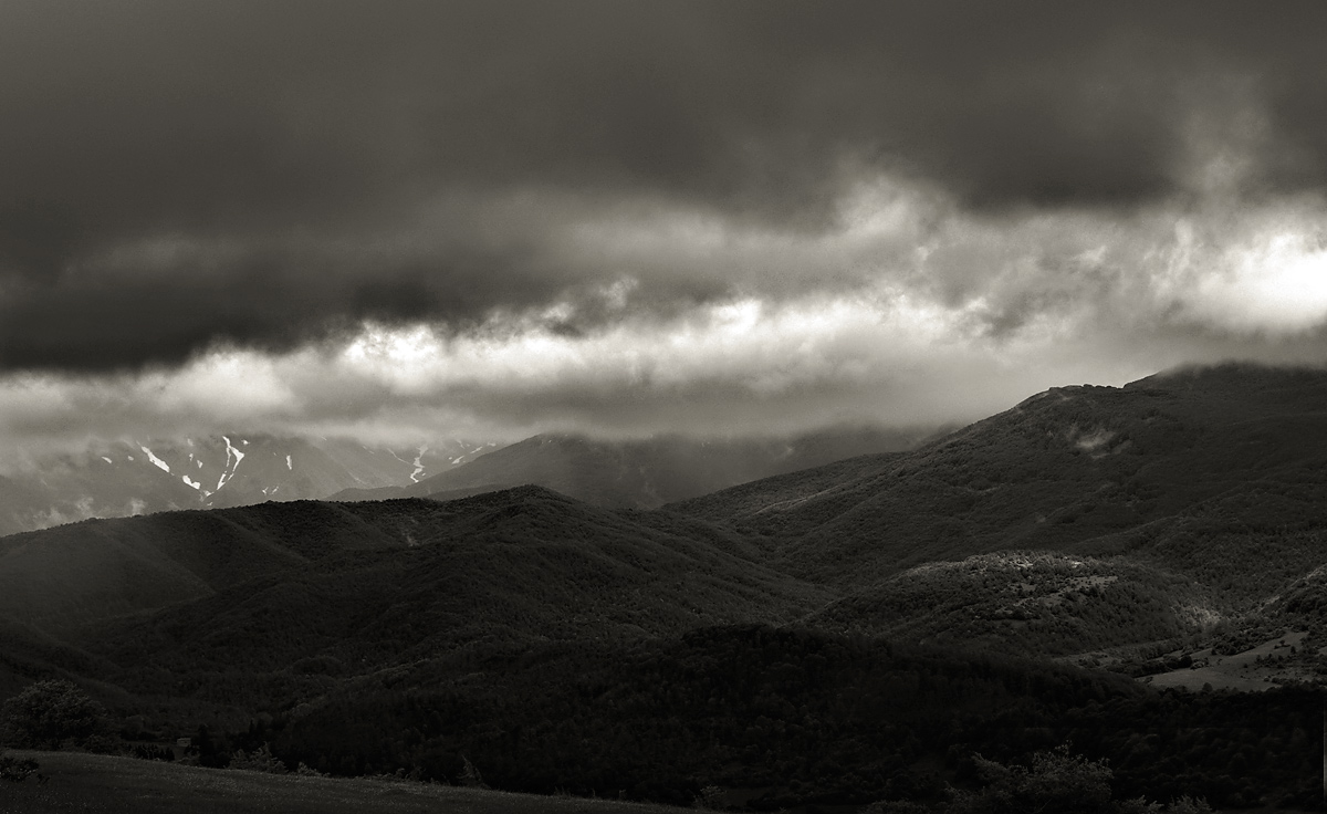
This is a really dramatic and evocative image. I like your color choice in the conversion toning very much. I wonder about the exposure or image brightness, though. I have my monitor cranked up all the way and it's still fairly dark... wondering if it lost some shadow details when viewers weren't at full monitor brightness. On the other hand, the image is meant to be dark and foreboding, I imagine. One suggestion I have that might be effective is to crop off the top at about 1 inch (or about 20%). The wider aspect ratio along with removing some of the nondescript grey clouds at the top could add to the impact. Clearly that's just a personal preference, this is a strong image as it stands. Nicely done! |






 Add photograph to your favorites
 Add photographer to your favorites

 Photographer found comment helpful.

