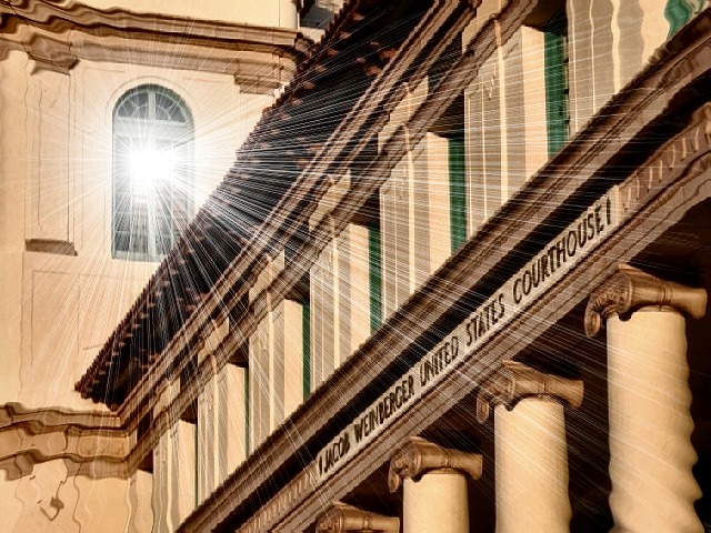
This is one of my favorites this week. I'm glad to see you took advantage of the relaxed editing rules this week. Your manipulation is obvious, but it is not 'cheesy' and it works very well. I like the strong diagonals in the frame and the columns at the lower right are great. Is this in DC? As long as you were 'Photoshopping' I would have cloned out the dark gray shadow at the top center of the frame. I like this a lot and give it a 10!
JD Anderson
Really like the point of view, shapes and forms, the tie in with the name of the building, light, and title. The distortion of the lower part of the image, especially the pole, is not appealing to me. I don't know if that was intended or not but it will cost you one point. Other wise excellent. (9) John Gill
Great photo, nice effect. Some of the "shafts of light" are rather pixelated (top right, in particular) which I think makes it look too artificial. I guess that if you'd applied the effect before scaling the photo down, the pixelation wouldn't have been so visible.





 Add photograph to your favorites
 Add photographer to your favorites


 Photographer found comment helpful.


