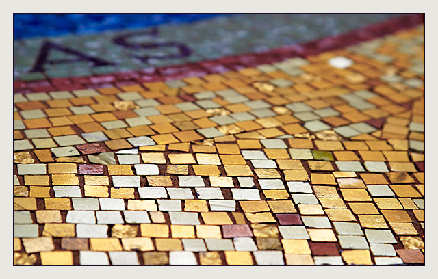
The colors of the mosaic tiles are extremely strong and eye catching in the front. As the eye drifts back into the picture the colors become richer but not as bright. Still farther back you have the grays and violets that work great together and are very much subdued. This change in brightness and colors works very well with your choice of using a shallow depth of field. I read the comments below and feel that most of the people who give advice do not understand the artistic value of shallow depths of field or realize that this just might be what the photographer was trying to accomplish. Your composition is strong, especially with just the two letters in the background. These two letters force the viewer to try and complete the word or wonder what was said.A complete word would have left nothing for the viewer to imagin. I feel this is a well thought out work that is a very strong yet simple image. When I look at an image I try to imagine what I would do to make it better, if possible. One of the things that could have made this a stronger image would be to add something that would give it a 3 dementional look. Perhaps placing a chess piece or some other object where the one white tile is in the upper right hand corner. Give it a try and see if the image improves. Great job! JG
I see the squares and I see the "A" and the "S" (barely), now what? I know these 2 letters have something to do with it because they are in the title but what? Since they are in the title they should be lighter and in better focus, in my opinion. Hope you explain this one.
Composition: Good
Technical: Nice DOF. Would have liked more event lighting, particularly at the top of the pic.
Meets challenge: Yes
Overall impression: Good technically, but not sure of the balance of the pic. 6
What is this a photograph of ?? Very creative idea. Nice range color. The top of the photo is a little bit blurry and causes a distraction to the eye. Nice job.
Well those certainly are squares :)
Suggestions: I think if the camera was closer to the surface, but keeping the same angle, and the DOF was a bit larger it would have helped.
good use of shallow DOF, a little, tiny bit too bright in the immediate foreground. Good interpretation, i was going to do maosaic too, wish I had now!
Nice random pattern, I think the depth of field would be less distracting lower to the ground. It is difficult to see why the squares are becoming unfocused...






 Add photograph to your favorites
 Add photographer to your favorites


 Photographer found comment helpful.


