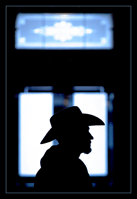
Gordon, this is a great shot... The silhouette is very strong and sharp. It stands out nicely against the background. Your long lens and focal length choice really makes this photo pop. For some reason that I can't really explain, I like the blue hue on this image. It just seems to work really well with the silhouette.
I can't really offer much suggestion for improvement without significantly changing what you have in this image. I understand that the window/door concept of this shot is strengthened by the window in the top portion of the image, but, toss the challenge conecept aside for a moment... I like that part cut out completely. Making a square shaped image from the bottom portion of the frame seems to be equally strong. Cutting off the top third or so of this image really makes the 'cowboy' become a much stronger part of the image.
I like your alternative view of this challenge as well. This was probalby my favorite shot of the week where a window/door was not the subject of the photo.
WOW! This is just.... amazing. If you set this up, your feeling for lighting and composition is amazing, but if you just got it by chance.... No, I can't believe that. Great work. 10!
This is a nice silhoutte that should have been cropped too right above the window he is in front of. If you look closely it is a little off center so I would have cropped a little off the right side to even things out a bit. I like the border aournd this one. Nice work.
not the strongest way of meeting the challenge, but it is met. i think the sillhouette of the guy is the subject rather than the door in the background. your title indicates that, too. but ... i really like your photo. i like how the sillhouette is sharp and distinguishable, and how the glass panels in the door are blurry around the edges. i especially like the blue edge to them. i think this photo would be even more powerful if the window behind the guy didn't have the panel in the middle, and i would also consider cropping out the top panel (at least for outside of this challenge, when this really can become a photo about the sillhouette) and turning this into more of a square photo. the frame you put around it works very well. good work! :)
The sharp contrast of the Stetson vs the hazyness of the door just doesn't work for me. Also the centering of the person lacks the creativity that was available. JG
First - I think that the windows and doors were generally supposed to be the subjects in this challenge more than backgrounds. Secondly - This is an outstanding photograph, even if the challenge was only partially met. I don't think the top window needs to be here. It's more distracting than anything else. The silhouette is very well done though. Great capture - Inspzil
That's a cool shot. I think I understand why you left the top window in, but I think I would have liked it as well, or better, with it cropped out. Love the silhouette.





 Add photograph to your favorites
 Add photographer to your favorites


 Photographer found comment helpful.
