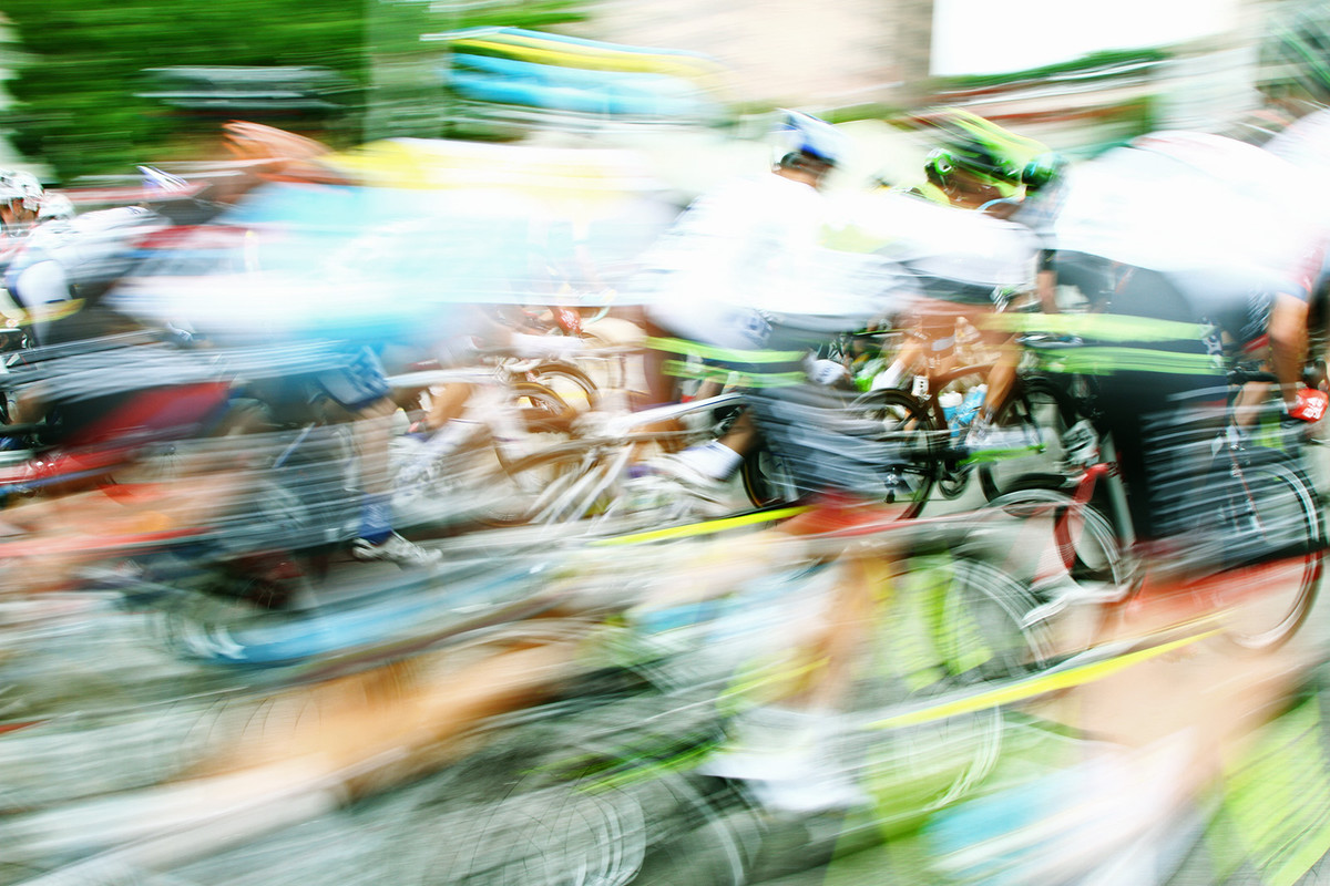
. . . The main part of this image that really didn't connect with me was the blur of the whites of the shirts, it was just too big a white blur and then at the next second below were bike tires almost in focus. Was just a bit to uneven for me I think.
Yep, the white shirts looked almost blown and were really distracting. Haven't read other comments, but what if you put a green layer over the whole and blended it in? Or crop just below the shirts? Or both?
This is a shot that rewards slow inspection. I love the little holes of focus and the oblongs of blur. I agree with skewsme about the top distracting from the action even it if provides much needed green for the challenge, it steals power. If you view a shot for 3 seconds in scoring, this level of complexity is tough to enjoy, and on that level it is a "meh" shot, not super green, not at all simple. The correlation between a great photograph and great entry in a challenge is not robust.
I suppose I'm not a huge fan of motion blur since my brain really likes order, and I struggled with the mix of heavy versus light lines and the opposition of blurred and nearly in focus. The main part of this image that really didn't connect with me was the blur of the whites of the shirts, it was just too big a white blur and then at the next second below were bike tires almost in focus. Was just a bit to uneven for me I think.
I am a big fan of this type photography. Love the motion, color and emotion that is brought out by introducing a dimension of time.
However, I am bothered (distracted) by the two areas of desaturated color. They seem out of place and artificial, esp in contrast with the similar areas that were highly saturated and contrasty. Even so, I would have place you much higher.





 Add photograph to your favorites
 Add photographer to your favorites

 Photographer found comment helpful.


