Greetings from the Critique Club
We have run out of fresh images to critique at the moment, so catching up on some older ones from the queue.
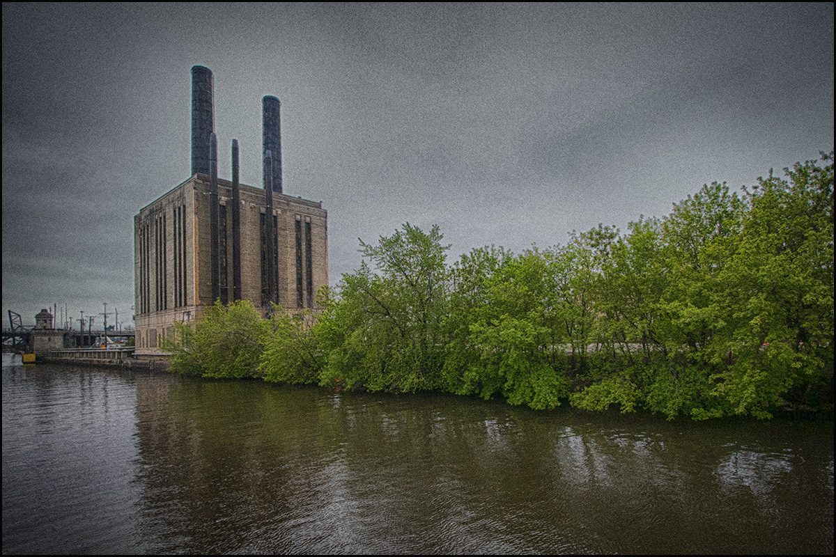
For the challenge topic the building hits the mark, no question there. I find the composition could be improved a bit. The dull colour of the Chicago River does not really add any value to the image. It's not very interesting and I would have cropped a bit tighter to place a bit more emphasis on the building yet still retaining Similarly with the trees, I would have cropped some of those out.
I'm not sure about the grain (and neither I think were most of the voters). I totally get why you added it, but it feels a bit too artificial. Main thing for me is the flatness - I think a contrast boost would have helped a bit, quite often after using HDR software images tend to look a bit "flat" and I think this is one of those cases.
Take this with a pinch of salt, just one person's point of view, but maybe explains the 5.2 score. |





 Add photograph to your favorites
 Add photographer to your favorites

 Photographer found comment helpful.


