returning for comments:
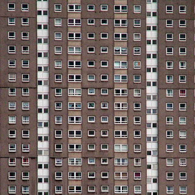
A cool shot which could have used just a tad more cropping to avoid the pin-cushion effect. Despite this, the strength of the image is a nice visual.
I like this shot. It appears so uniform at first glance and yet there is so much individuality in each window. unfortunately, either the focus or resolution of your camera wasn't quite right: the fine detail is lost. Also I wonder if a crop losing the right hand side white vertical strip + some of the bottom would add a bit of visual interest by losing the strict symmetry? wel done
Can't miss the implied lines in this one! Yep those lines are there. Lots and lots of lines. Going up and down and across. Yep lines, and then there's the ......err...the...errr...windows, yes the windows, in lines and lines.
Sorry I'm being facetious. I actually like this shot, how many would have 'seen' this shot from looking at that building? Ideal for this challenge. Spot on. Its very powerful at first, quite an impact but it quickly becomes a bit boring when you realise that there's nothing goig on at any of the windows, I've looked at them all.
Having said that I don't know how you could add interest, so I gave it a six. Good shot though, I wouldn't have been disapointed with it.
this would make a great album sleeve - actually, it has strong reminisces of a led zeppelin cover. anyway, i do like the symmetry and repitition in this A lot. regards to fitting the challenge, i can't decide if the lines are implied or not... i think the white ones are, but the beige ones are not. so, yes, it fits. i do wsh it were a little bit sharper though. 7.
This is an interesting idea, but the composition is far too sloppy. Since this piece of architecture is symmetrical, level & plump then that should be reflected in the photo. The hint of windows on the far right edge and the uneven cropping of the very top and bottom windows hurts the picture, in my opinion. Lastly, it's far too "flat." The same shot could be done at a different time of day when the light is far more interesting. That would result in a far better picture. As is, it's very neutral...and neutrality is great for the Swiss but lousy for art.
Very nice! I feel dizzy just looking at this picture. ;-) Not sure if you did anything to make the colors subtle but I think it needs a little color to give it some life or impact. But then again it looks awesome just the way it is, especially with the vertical lines. Way to go!
Good idea (I had a similar idea, shot it, but didn't use it, and this is better anyway). It would have been nice to perspective correct it and square it off a bit (see the top of the shot). Or maybe not perspective and bad architecture ;)







 Add photograph to your favorites
 Add photographer to your favorites


 Photographer found comment helpful.


