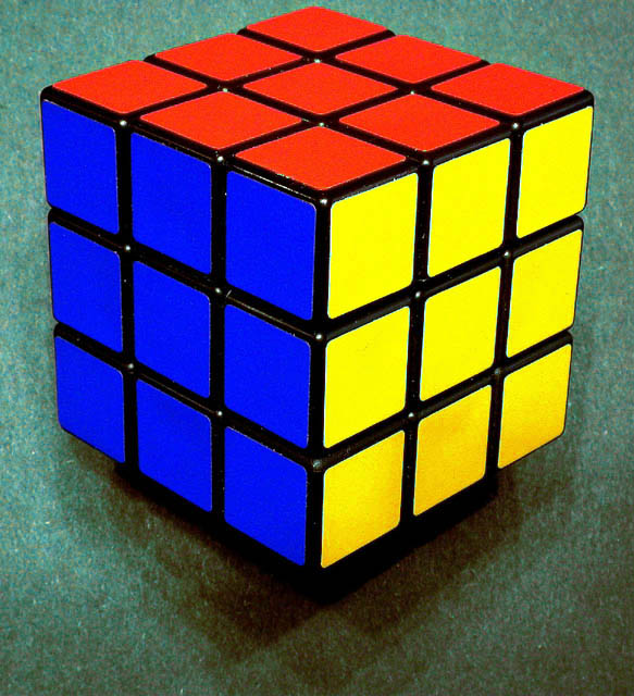
Composition (content) The angle from which you shot this works really well.
The space between the left and right are in balance, but the tight crop on top doesn't work with the large space at the bottom. I guess the intention was to include the somewhat interesting shadows that are a result from overhead lighting. Perhaps it would have worked better to fill in thos shadows with a spot from the front to allow for a tighter bottom crop and more room on top. Cutting trough the shadows of this entry would't be nice.
The colors are very hard and bright (but also noisy, see digital processing) and that doesn't work with the dull toned busy green background (looks like a biljart/snooker/pool table). I think that a calmer, more color consistent tone would work a lot better.
The lighting from above casts hard shadows between the squares, further enhancing the power of their color. A fill in light could also take that away and make it look more natural.
Camera Work (Technical) See above. Sharpness was probably ok, but taken away again in the post processing process. Good depth. No further comments as no information was given by the photographer.
Digital Processing (technical) The main problem of this image is compression.
Its filesize is 80kb of the 150kb allowed. It has hurt the quality pretty much:
* The edges are rough instead of smooth
* There is a lot of jpeg noise and color inconsistency in the colored patches
* There is a lot of jpeg noise and color aliasing in the background
* There are jpeg artifacts around the edges of the cubicle
* There is a clearly visible jpeg block compression pattern in the corners
Saving at a lower compression ratio/higher quality could have avoided a lot of these issues and would result in a sharper picture with a less busy background, consistent color patches and better edge sharpness.
WOOHOO! It's above a 5 so u can't complain ;P
I was actually one of the ppl who gave this a 4... doh.
I think it has some quality issues. Looks like artifacting maybe but it's just not smooth. The composition isn't bad if not a tad boring. I don't think the green background really helps anything. Black might be better. Maybe you could crop it somehow so that the whole thing isn't showing and add some interest. I dunno. The colors are just SO bright and I don't really understand your placement of it inside the frame - w/ more space on bottom.
Clear and sharp. Cropping needs to be equal all the way around and you have much more space at the bottom, and sides, than at the top. But this is just my opinion. Otherwise nice one.
Composition: Probably preferred it centred
Technical: Good. Maybe shadow is a little dark?
Meets challenge: Yes
Overall impression: Square vibrancy really brings this to life. 7
This picture came out very clear. I think that you should have switched the colors so that they werent all solid. I believe that would have created much more intrest. Good Work
Interesting shadows on the bottom side, leading me to wonder about your lighting set-up. The colors are incredible so vibrant. Nice work! (And plus, everyone loved Rubik, right?)
I really like the colors and composisition here. It would really benefit by using more of the alloted 150kb file size though. That would sharpen it a lot. THere seems to be a lot of JPEG artifacts.





 Add photograph to your favorites
 Add photographer to your favorites


 Photographer found comment helpful.


