I would love to know how you did this under basic editing rules. I really like the effect! It almost looks like poster edges -- is it? Come on, I gave you a high score -- share a little knowledge ;-)
this is an idea that is worth exploring however the implied povery too me is not strongly presented here for me however I like the way you have utilised the shapes and the darkness here.
Very strong entry. The combination of a photograph and title is perfect and leaves a wide open space for interpretation. The lighting and viewpoint fits the subject.
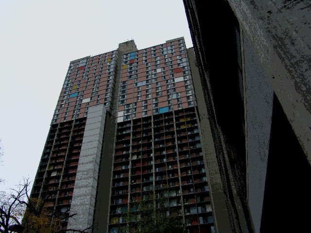
I like the angle of the building, it really gives it a sense of height, an imposing nature. However, i don't know if the image is over-saturated or solarized, but the "business" of what should be a flat color or gradient detracts from the image.






 Add photograph to your favorites
 Add photographer to your favorites


 Photographer found comment helpful.


