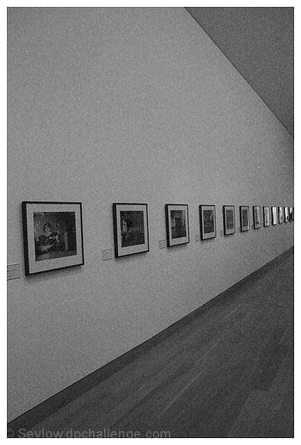
Thanks for all your comments. Yeh this was not too good - the top and bottom of the picutre should have been parallel but when I snapped it I was not even thinking about implied lines, if i had then i might have been a bit more careful!
Thanks Kavey for making it one of your favs - it means a lot to me when someone picks one of my photos!
Composition has a really strong impact for me. I love the very strong diagonals, the way the wonderfully even and repetitive 'line' of the images diverges to the invisible convergence point just as the real lines do. Black and white is perfect for this shot.
good perspective shot - the edge of the left photo not being parallel to the edge of the pic is a little distracting as is the part of the ceiling that shows up
hmmm, it certainly fits the challenge. I like the look of this shot, and the graininess too. Though I wonder if this might be one of the few justifiable cases for selective desaturation? also, i think a landscaped orientaiton (with less ceiling and floor visible) might have helped drawing your eye along the picutres thereby emphasising the implied lines. It's a good arty concept though. 6.






 Add photograph to your favorites
 Add photographer to your favorites


 Photographer found comment helpful.


